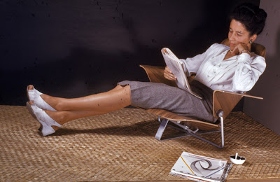
MODERNISM 1.1: Modern Interior Design that Endures Sponsored by Knoll Studio, Knoll Textiles and Hudson Home

Please Join us for
MODERNISM 1.1: Modern Interior Design that Endures
Sponsored by KnollStudio, KnollTextiles and Hudson Home

Presentations on the history of Classic KnollStudio Furniture and KnollTextiles.

See and experience Twentieth Century Modern Masterpieces.

Learn about designs by Eero Saarinen, Florence Knoll, Harry Bertoia, Warren Platner and Jens Risom.

Touch and hear about KnollTextiles designed in the 1940's and 1950's that are still in production today.

See Twenty-First Century design pieces that will be the classics of tomorrow.

Free Admission, Door Prizes, Food and Drink to be provided by Knoll Studio, Knoll Textiles and Hudson Home.

Sunday, June 6, 2010, 2:00 to 4:00 PM
Hudson Home
1500 Grand Boulevard
(2nd Floor above Retro Inferno)
Kansas City, MO 64108-1404
(816) 421-3629

We request that you please RSVP by clicking on the link below.

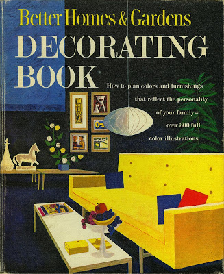
Better Homes & Gardens Decorating Book Cover - 1961- Modern Illustration

Wow it has been a while since I posted. Attribute it to Post Runnells Tour recovery I guess. Lets kick things back off with and image or two.
What can I say about this image from the cover of the 1961 Better Homes & Gardens Decorating Book? It just oozes Mid Century Modern Goodness! The primary colors, the MCM art, the Nelson bubble lamp, the sofa, the tables, the fruit bowl all make me drool. It even has a copy of BH&G magazine on the coffee table.... This kind of artwork makes me wish I lived in that era. This might have been the best two bucks I ever spent on a book.

Rapid Rocker by Ralph Rapson

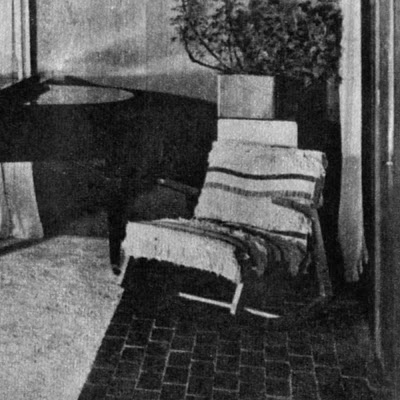
The image above is a 1950's photo of the Ralph Rapson designed Rocking Chair that David B. Runnells owned in his home in Fairview, Kansas. If I had to guess, I would say that it is draped over with a Swedish or Scandinavian wool weaving. The rocker is still in the family and is owned by David's daughter Jill.

The rocker is even more significant because Runnells and Rapson worked on several design competitions together while they were both working in the Saarinen offices in Michigan. In fact, the earliest version of the rocker was done for The Museum of Modern Art, "Organic Design in Home Furnishings Competition," 1940-41, while Rapson and Runnells were working together on other competition projects. More on that later. One would asssume that this furniture purchase was a little homage to his friend Ralph.


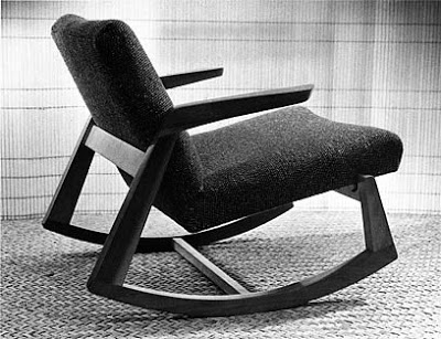
Ralph Rapson. Rocking Chair for the "Organic Design in Home Furnishings Competition," The Museum of Modern Art. 1940-41. Black painted frame, reupholstered with linen webbing 32 x 28 3/4 x 39"; seat h. 14 3/4". Collection Ralph Rapson.

Manufacturer: Knoll
Name: (Rapson) Rocking Chair
Designer: Ralph Rapson
Model Number: 57 U
Production: 1945-46
Dimensions: Unknown.
Materials: Birch frame with fully upholstered seat and back
Photo by:
Ralph Rapson

The image above is photo of the rocker design as it looked when it was in production with Knoll as a part of the Knoll "Rapson Line." The rocker was one of eight products introduced by Rapson. I scanned this image from a 1945 Knoll catalog. This is the "solid wood" version that Runnells owned and the version that Knoll sold at Bloomindales. Bloomingdale's took out a full-page ad in the New York Times to promote the chair, proclaiming it an "innovative and attractive modern take on a traditional piece."

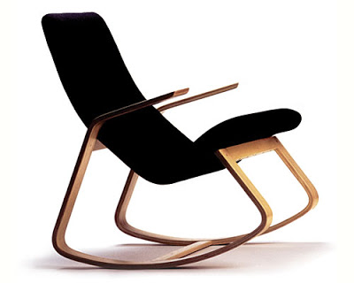
More recently, a bentwood version of the design has been released to the public and is still in production. The chair is based on sketches from 1942 that are obviously done after the MoMA design, but predate the 1945 Knoll "solid wood" production. A bentwood prototype version of the Rapsin Rapid Rocker was shown in a 1951 photograph in the book, Rapson: 50 years of Modern Design. This newer bentwood design is now available from the Wieler Store and Highbrow Furniture.
To ensure that the chair meets the architect's original standards of quality, production is being overseen by Rapson Architects of Minneapolis, MN. The maple frame is finished with two coats of clear lacquer. The seat is upholstered with a high-quality polyolefin fabric. The fabric resembles wool and is is exceptionally tough and stain-resistant. The chair's dimensions are 26.25" wide, 35" high, and 33.25" deep, with a weight of about 30 pounds.

James Ingraham Clark Residence by Runnells Clark Waugh and Matsumoto Architects - Architects House Themselves

The James Ingraham Clark Residence won a mention in the P/A (Progressive Architecture) Awards in 1947. Below is an excerpt, including captions, from a Progressive Architecture article in April, 1949, pp 66-69. This is one of a few buildings known to exist from the Runnells Clark Waugh and Matsumoto Architects partnership. The others are the Kansas City Art Institute Art School Building and a possible Doctors Office that may not exist anymore. The first two photos are by Gene Hook all others by Fred Gund.


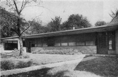
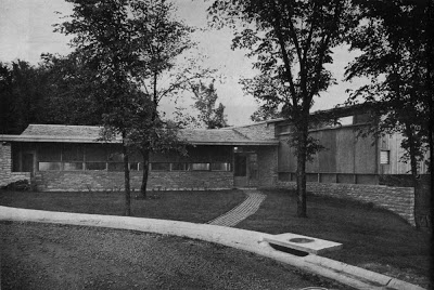
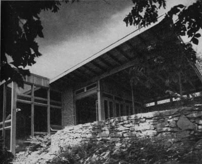
This is the home of one of the architects – James Ingraham Clark. -- looking south down the slope

House: Leawood, Kansas
Runnells Clark Waugh & Matsumoto Architects

PROGRAM: Suburban residence for a growing family. Space provided under present bedroom wing for duplication of facilities on upper level.

SITE: Land at end of cul-de-sac street; one acre sloping toward the south; stone ledge under most of actual house site.

SOLUTION: Plan organized to turn its back to the street side and open out to the east and south. Design developed to have advantages of prefabrication although built on the side. Ledge proved both solid and flat; hence, prefabricated heating panels and foundations were laid directly on the stone; footings needed under bedroom portion only where rock ledge ran out. Plan worked out on a 4’-1/4” module – the 4’ to take standard sheets of plywood; the ¼” to allow a space between sheets, eliminating any fitting or butting at the joints. Dry construction throughout.

MATERIALS AND METHODS

CONSTRUCTION: Framing: wood. Walls: no footings; stone foundations on solid rock; native stone. Interior finishes: Douglas fir plywood; exterior: 5-ply waterproof plywood. Floors: wood sash: double-insulating glazing; glass block (bathroom only). Insulation: acoustical; cement-impregnated wood-fiberboard exposed on ceilings; thermal’ double-thick expansible blanket; flameproof cotton: glass-wool batts: blown-in wool type. Partitions: frame. Surfaced both sides with plywood. Doors: birch-surfaced hollow core; solid flush exterior doors.

EQUIPMENT: Heating: hot-water radiant panel, zoned for three areas; gas-fired boiler; automatic controls; attic fan. Kitchen: electric stove, refrigerator, dishwasher, garbage disposal unit, deep freeze, and exhaust fan. Special equipment: water softener.


front door - (looking south)

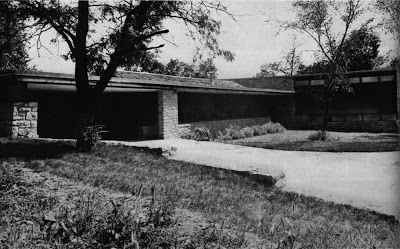
view from street (utility rooms, left, bedroom wing, right)


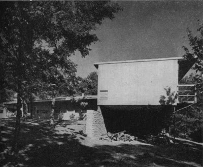
bedroom wing, additional bedrooms to be added later at lower level


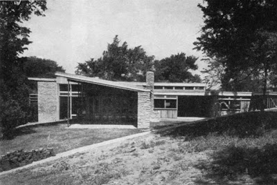
view from east (living rooms left, outdoor living, right center, service right


living room and porch (right); glazed stairwell (left)


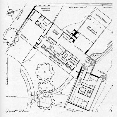
(first floor plan)


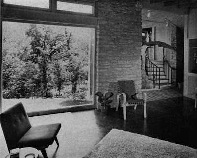
south window of living room and stair hall to bedroom wing

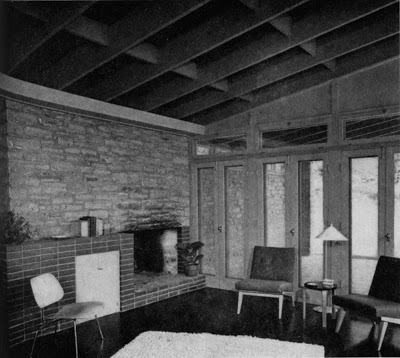
fireplace corner of living room with east porch beyond


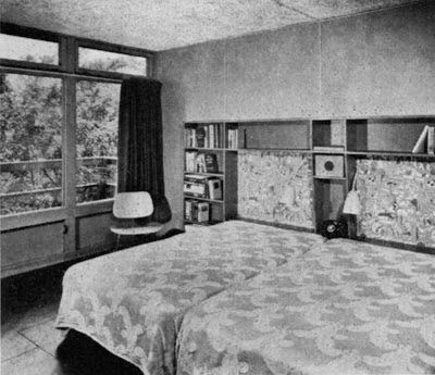
master bedroom with cantilevered deck outside southeast window wall


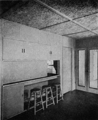
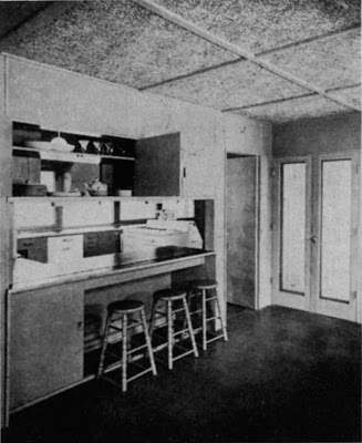
wall between dining area and kitchen


same wall, opened up

James Ingraham Clark Residence by Runnells Clark Waugh and Matsumoto Architects

Name: James Ingraham Clark Residence
Architect: Runnells Clark Waugh and Matsumoto Architects
James Ingraham Clark, Project Designer
Year Designed: circa 1947-48
Builder: Don Drummond
Year Completed: circa 1948
Size: Unknown
Location: Leawood, Kansas
(Greater Kansas City Area)
Type: Residential
Style: Modern
Status: Good
Photographer: Gene Hook
Photos scanned from and article excerpted from: The American House Today : 85 Notable Examples Selected and Evaluated by Katherine Morrow Ford and Thomas H. Creighton, Reinhold, 1951, pp 134-135

KANSAS CITY, MISSOURI

Built for one of the partners in an architectural firm, this house of the James Ingraham Clarks is planned carefully for expansion as the family grows. It turns away from the street – originally a quite thoroughfare which has since became much more busy, partly because people come to see the house – and faces towards the south and southeast on a sloping site which ends in a wooded creek bed. When the house was built there was one child; now there are two, and family plans are for two more. Hence it was desired that the house could grow both in bedroom accommodations and in living space. Facing the street is a “core” which will not change: utility rooms, kitchens, laundry and garage. Past these rooms as one enters the house is a living room which is at present reasonably large, but certainly not oversized. In the future, as the plan indicates, this room will be extended, and even may have a porch on the end as a final expansion. The solution to the addition of bedrooms is made possible by a steep drop of fifteen feet in the site at the point where the bedroom wing breaks from the main house. Under the present two bedrooms there is now an open terraced space which, can, when the family has grown, be converted into a lower bedroom floor with three rooms. Mr. Clark is thoroughly objective about the value or lack of value of a number of ideas that went in the house. Orientation for sun control, studied mathematically, has worked out excellently. Plans to use a certain amount of site prefabrication – panels constructed on the property and raised into place – did not work so well, because of unfamiliarity of the available labor with this system. There is “nearly too much: storage space in cupboards, drawers and shelves. These are minor troubles, however. In general the dry-wall construction, the acoustic ceilings, the efficient kitchen layout, and the orientation have worked very well.

RUNNELLS, CLARK, WAUGH & MATSUMOTO, ARCHITECTS


David B. Runnells Residence - Architects House Themselves Update - The Self-Cooling House

After I posted about the David B. Runnells Residence, designed for himself and his family, I got a phone call from Jill (Runnells) Grose. I met her again last week, our third or fourth meeting. Thanks to her, we have some great additional information about the now demolished house her father designed for his family. The article and photos were published in the New York Times Magazine on July 26, 1953. I have reposted a couple of the images because they were larger and better quality images and I wanted to include the captions from the recently found article. The magazine touts the advantages of natural ventilation over 1950's advances in home air conditioning. Here is a the article:

Self-Cooling House
by Cynthia Kellogg

Kansas City, MO- Despite the rapid increase in the number of completely
air-conditioned homes (an estimated 50,000 this year), natural methods of
cooling a house should not be overlooked. A new example of such a
“self-ventilating” home is pictured on these pages. Oriented on its plot
to take advantage of the prevailing winds, it was designed by Architect David
Benton Runnells for his family and is located in near-by Mission, Kan., where
summers are hot. Mr. Runnells used many architectural details, such as
piercing walls with many doors and apertures to aid the air flow, as well as a
simple decorating scheme to achieve a cool atmosphere. To reduce the
temperature of the living room, the roof, which can be used as a sun deck, has
been insulated with aluminum foil and, on hot days, can be flooded with water.
--Scanned from New York Times Magazine, July 26, 1953--

Here are the photos with their captions included under each photo:

OVERHANGING ROOF shields house interior at right, designed by David Benton Runnells, from the sun's heat. Screened gallery on upper level permits free flow of air through bedroom windows and doors which open into it.


BREEZEWAY, shown below, circulates air beneath bedrooms to help cool them. Heating and laundry units are in room on right, seperated from the body of house. Front door, upper left, is at the end of gangway-like walk.

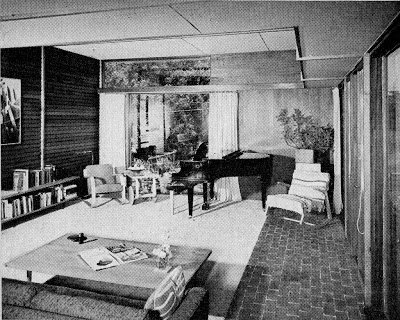
TEXTURES are contrasted, rather than colors, to give cool look to living room at left. Brick "traffic lane" cuts across cork floor under rug. Cool fluorescent light is concealed in a wood strip above picture window. (Editors note: Someone used a little mid-century photoshop on this photo to edit the outside view thru the sliding glass door. Compare this to the previously posted image!)

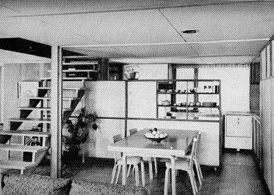
OPEN FLOOR PLAN aids in ventilation, as below. A low storage wall, over which air can pass, separates the kitchen from the dining/living area. Open stairway encourages airflow in to television room at left.

BUILT-IN STORAGE units used throughout the house reduce amount of furniture to a minimum. The television set and radio are contained within this wall.

DOOR, a narrow version of the French window, is used more to admit air than as an exit. Birch cabinets and matching wood funiture contrast with redwood walls.

OVEN, right foreground, is a separate unit built into storage wall away from work area. Burners, more often used, are fitted into counter top at end of kitchen.

APERTURE in walls in corner of bedroom permits flow of air from the rest of the house. Light within the opening also illuminates the stairwell on other side.

David B. Runnells Residence - Architects House Themselves

Name: Runnells Residence
Architect: David Benton Runnells
Year: Designed circa 1950
Year Completed: circa 1950
Size: unknown sq. ft. 3 bedroom 1 1/2 bath
Location: Windsor Street, Fairway, Kansas
(Greater Kansas City Area)
Type: Residence
Style: Modern / International Style
Status: Demolished
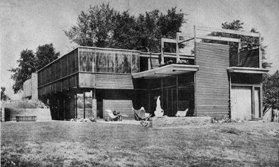
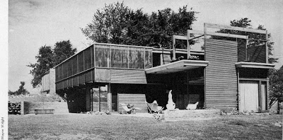
Photographer Wayne Wright, taken circa 1951
Scanned from Architectural Record, February 1955

This Residence was built by David B. Runnells for himself, his wife and two children. It was located on a golf course lot in Fairway, Kansas and was near a few other houses of his design. The plan would suggest certain Scandinavian influences, while the exterior appears that Mr. Runnells may have been influenced by the work of R.M. Schindler. We can also see some relationship to the work of George Matsumoto who had partnered with Runnells just after World War II.
Runnells traveled extensively in Europe on a Scholarship after college and we see in the photos that he furnished the home with many pieces of Alvar Aalto furniture, which he first saw while in Finland in 1936. The Ralph Rapson Rocker pictured is significant because Runnells attended Cranbrook and worked in the Saarinen office with Rapson.

Sadly, the home was torn down in the 1980's and replaced with a French Country McMansion.

Be sure to tour some of the remaining homes by David B, Runnells at KCMODERN's,
David Benton Runnells House Tour and Party.

We will feature at least six Modern Houses by the architect. The dates of the events are
September 19, 2009 for the Runnells House Party and
September 20, 2009 for the Runnells House Tour.


Frank Bott Residence Interiors by Frank Lloyd Wright - Frank Lloyd Wright Building Conservancy Leadership Circle Event

Name: Frank Bott Residence
Architect: Frank Lloyd Wright
Date Designed: 1956-60
Builder: Unknown
Date Completed: 1963
Size: Unknown
Location: Kansas City, MO
Type: Residential
Style: Organic
Status: Good condition with a diligent owner
Photographed by: Robert McLaughlin

Some of the KCMODERN crew helped with the Frank Lloyd Wright Building Conservancy Leadership Circle Event a little over a week ago at the Frank Bott House. Here are some interior photos that I quickly snapped off before the guests started to arrive.

Frank Bott met his wife Eloise at the Wright designed Florida Southern College. Not much has been written about this design, but it is documented that Eloise had Wright narrow the kitchen or “work space” after the first design so she could reach everything by turning.

Construction is “rubble” stone desert masonry, consisting of over a mile of stone farm wall brought in from the Flint Hills of Kansas. The interior woodwork is Honduran Mahogany. The home features many mahogany built-ins and horizontal batten paneling that give the home an almost yacht-like feel.

The home, which is situated north of downtown Kansas City on a bluff above the Missouri River Valley, presents a rather austere facade with battered desert masonry walls and a large stone fireplace mass facing the street at the north edge of the site. Living areas face south with glazed views of the Kansas City Skyline, the downtown airport and the Missouri River below. A daring cantilevered balcony, rivaling Fallingwater's, projects boldly towards the views to the south and out over the dramatic escarpment of the site. The master bedroom is located with the main living areas at the entry level, with the secondary bedrooms located on a lower level, which daylights because of the sloping site. The plan of the house is based on a 4 foot square module.

Taliesin apprentice, John Howe did preliminary drawings for the Bott residence. The final version of the design and working drawings were done by apprentice, Cornelia Brierly. The drawings were completed in 1960, the year after Wright’s death in 1959. Construction was completed in 1963, costing just over $200,000.

All of the furniture in the house was designed by Wright and is original to the house. Cornelia Brierly also provided color and fabric choices for Wright’s designs. Many of the furniture pieces are reminiscent of the furniture line Wright did for mass production by Heritage Henredon.

Thanks to Scott Lane for help on the details about the house.

Interior photos have been deleted at the owner's request. Please see the exterior photos here.
Snower Residence by Architect, Marcel Breuer - Photo(s) of the Week

Name: Snower Residence
Architect: Marcel Breuer
Year Designed: 1954
Builder: Unknown
Year Built: 1955
Size: Unknown sq. ft. 3 bedroom 2 bath
Location: Mission Hills, Kansas
Type: Residence
Style: International Style
Status: Endangered due to the value of the lot in Kansas City's most affluent neighborhood
Photographer: Robert McLaughlin

Description: This residence was built by its current owner who commissioned Breuer to design it for them in 1954. The owners have painstakingly maintained the original interiors as designed by the architect. The exteriors also remain exactly as they were originally planned. The house was designed as a long and narrow box, housing the living and bedroom spaces, built on a masonry base containing the garage and a family room. Large cantilevers at both ends dominate the design much like Breuer's own house built in 1947, in New Canaan, Connecticut. This may be one of only two Breuer House built West of the Mississippi. It is likely one of the most original Breuer Houses standing today.

I had to dig around my hard drive to find these photos taken with my first digital camera back in April of 2004. They are more candid snapshots than architectural photography but they give you a taste of the exterior and interior of the house.


Eero Saarinen Shaping the Future - Exhibition in St. Louis


Three members of KCMODERN headed off to St. Louis this past weekend to see the exhibit, Eero Saarinen Shaping the Future at the Mildred Lane Kemper Art Museum. It was an exceptionally well curated show. My personal favorites were the GM and the Deere headquarters. The Modern furniture lover in me enjoyed the section on his furniture including the Organic Chair and the classic Knoll pieces such as the womb chair and the pedestal or "tulip" series. I recommend that anyone interested in Modern architecture or furniture should try to see the show before it closes on April 27, 2009. Otherwise you will have to catch it in New York in late 2009 early 2010. Also be sure to check out the book by the same name.

We also met up with a few Modern friends to tour some great Modern neighborhoods (thanks Dan, Grant, Nathan and Neil) and were surprised by some spontaneous invites into several really sweet Modern houses. We will take turns elaborating on the houses in the near future.

Bixby Residence Rumpus Room by Kem Weber - Modern Illustration - Modern Photo of the Week

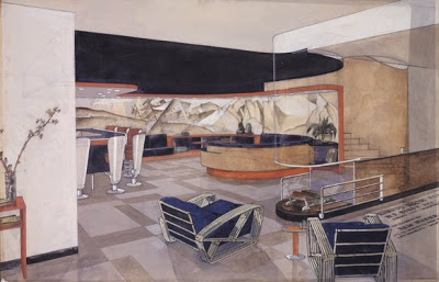
Kem Weber. Elevation of Rumpus Room for W. E. Bixby, Sr. Residence, 1936-37. Watercolor and graphite on board. The University Art Museum, University of California at Santa Barbara.

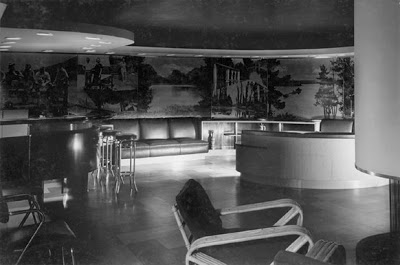
Rumpus Room of W. E. Bixby, Sr. Residence, Kansas City. Photograph by R. B. Churchill, 1937. The University Art Museum, University of California at Santa Barbara.

This illustration and photograph are the interior designs of Kem Weber for the Bixby Residence which we featured an exterior photograph of here last week. The Moderne Style residence is located on the Missouri side of State Line Road. I am sure that many of you have driven by this house hundreds of times.

Weber is best known for his designs for the interiors of the original Walt Disney Studios in the 1930's and the ubiquitous Airline Chair (1934), which was used thoughout the studios.

In 1936 and 1937, Weber designed thirteen rooms for the Walter Edwin Bixby, Sr. home that was done in an uncharacteristic Modern style by noted Kansas City architect, Edward W. Tanner, who designed many of the buildings on the Country Club Plaza.

According to the University Art Museum, University of California at Santa Barbara website:
In its 1939 review of the Bixby interiors the London-
based International Studio praised Weber’s exploration
of the full creative potential of the Moderne aesthetic
through bold colors—Dubonnet (maroon), midnight
blue, coral red—and such new materials as aluminum,
glass block, linoleum, and masonite as well as richly
veneered plywood and cork paneling. Weber used
moveable and built-in furniture, combined with
veneered wood paneling surrounds to manipulate the
existing outline of Tanner’s rooms. Critics singled out
Weber’s distinctive use of the curved line in his design
for the built-in furnishings of the basement rumpus room
and its drop ceiling with concealed overhead lighting.


Bixby sold the house 1949 and unfortunaly the interiors were eventually dismantled, but we still have Weber's original renderings to show us this great design.

See the University Art Museum, University of California at Santa Barbara website for a more in depth discussion of the Bixby Residence.
Page 1
Page 2
Page 3

Experimental Eames Lounge Chair

Well this experimental chair is something that Charles and Ray Eames never put into production and the 1946 date on the photo predates the ubiquitous Eames Lounge Chair production by ten years. The chair is contemporaneous with the introduction of the Eames LCM and the seat shows some relationship to that design. But we can see that the many of the design elements of the Eames Lounge Chair are there. The curve of the seat, the back and arms as separate plywood pieces are all represented in the classic Eames Lounge Chair. Just add the beautiful leather upholstery.

The chair does show a rather crude, by Eames' standards, leg and arm attachment, which begs the question, was this a prototype to test the seating comfort only? Or was this simply early in Eames' career before their refinement skills were brought up to the highly refined standards we expect to see in Eames furniture today?

Via Shorpy

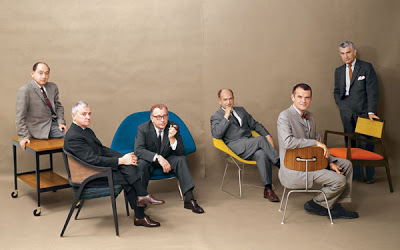
The Cover Boys of Modernism

What a photo! I wish I was a fly on the wall for this photo shoot.

Can you name all of the Design Stars of Modernism in this photo from Playboy Magazine without looking? Perhaps their chairs give you clues to their identities. The furniture from left to right is, Herman Miller Serving Cart (unknown model), circa 1950s; Dunbar 5480 "A" Cane Back Chair, 1954; Knoll 70 "Womb" Lounge Chair, 1948; Knoll 421 Small Diamond Chair, 1950; Herman Miller DCM Chair, 1946; "Caribe Hilton" Open Armchair, 1949.

And the Cover Boys of Modernism from left to right are, George Nelson, Edward Wormley, Eero Saarinen, Harry Bertoia, Charles Eames, Jens Risom. Some were life long friends, others were serious rivals and competitors. Bertoia worked for Eames at one point, but had a falling out. Saarinen and Eames designed the groundbreaking designs for the New York MoMA's Organic Design in Home Furnishings. Eames and Nelson were the primary designers for Herman Miller.

The egos that must have filled the studio while taking that picture. How did they get all of these Design Heroes in the room together? Or did they get them together. Maybe it is two or more photos joined together. There is a peculiar gap in the middle, but that could be the photographer planning ahead for the gutter of this two page spread.

A while back I purchased this July, 1961 issue of Playboy Magazine that contains this article and photo spread and I think it is the best Playboy centerfold ever. This is Modern furniture P O R N. I told my wife that I just bought the magazine for the pictures, not the articles.

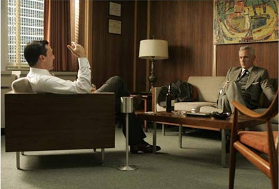
KCMODERN Loves Mad Men


Just in case you have been too busy working on your Modern house to watch TV, we thought that we should tell you about one of the hippest and cool shows on TV. The second season of AMC's Mad Men features some of the best Mid-century Modern goodness that we have seen on the little screen (although our little screen ain't so small anymore).

The first season of Mad Men was set in the 1960 world of a Madison Avenue Advertising Agency. Season two has fast forwarded to 1962 and has extended its luscious set dressing beyond New York to locations such as Palm Springs. While it took me a few episodes at the beginning of season one to warm up to the characters and the story line, the sets and the fashions are what kept me coming back every week.

The show has not escaped acclaim outside the world of mid-century modern lovers either, with its 6 Emmys, including outstanding drama series for season one. If you missed season one it is available on DVD.

The season two premiere episode is available online for free here.