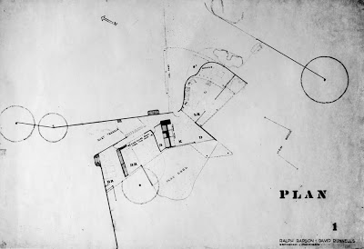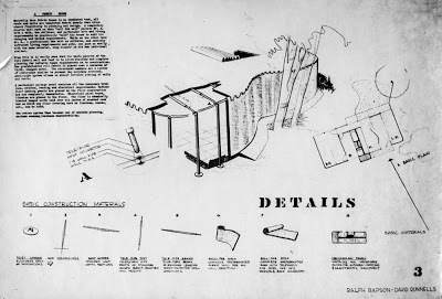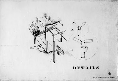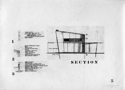
Fabric House Elevations by Architects, David B. Runnells and Ralph Rapson

Ralph Rapson Quote from Ralph Rapson Rules, Architecture magazine, March 15, 2005


Rapson’s focus on affordable housing predates the Greenbelt project (Arts+Architecture Case Study House No. 4). ”In the 1930s, David Runnells and I designed an earth-sheltered house we called the Cave House. We also entered another competition with a fabric house, where I made an ill-advised comment that no longer would the architect be necessary because people could simply go to the hardware store, buy their fabric, and roll out their house. Charlie Eames was on that jury, and said that we were thrown out of the competition for that particular comment.”
Many thanks to Ralph's son, Toby Rapson and Grandson, Lane Rapson of Rapson Architects for giving us permission to use these images.

For more images like these read, Ralph Rapson: Sixty Years of Modern Design by KCMODERN friend, Jane King Hession.

Fabric House Model by Architects, David B. Runnells and Ralph Rapson

Text taken from the competition presentation:
A Fabric House

Basically this house is and insulated tent, all roofs and walls are insulated fabric panels that allow the utmost flexibility in planning and design. A completely plastic wall such as this “roll fab wall” permits Mr. A., with a wife, two children, and a particular site and living requirements to practically “mold” his house to suit his changing and varied requirements. While on the other hand Mr. B., a professional man with no children, and entirely different living requirements and site, can, just as easily, with the same material, wrap himself in his own individual shelter.

From this it is easily seen that the basic purpose of the roll fabric wall and roof is to
allow absolute and complete planning for infinite human requirements as to construction. The prefabricated roll fabric is placed over a skeleton of light, stamped metal. The structural members are a system of tele-pipe similar to present day airplane sections. A tele-pipe system allows and almost infinite placing of walls and roof.

A mechanical package contains all of the necessary bathroom, kitchen, heating and electrical requirements. Radiant floor heating panels are placed in the floor construction and are completely demountable. Electrical panel boxes, likewise are placed in the floor. The floor is chemically treated tamped earth laid over six inches of crushed rock bed on which any floor covering such as linoleum, canvas, etc., can be laid.

The entire system becomes thus becomes one of maximum planning, maximum economy, maximum demountability.

Fabric House Drawings by Architects, David B. Runnells and Ralph Rapson

About a month ago I received a box of papers and a couple of portfolios from David Runnells daughter, Jill (Runnells) Grose. One of the most interesting things in the box was a hand made bound brochure with canvas fabric pages. Laminated to the pages were 8x10 photos of drawing boards and a model that Ralph Rapson and David Runnells made for a design competition presentation. The project was called the Fabric House and I was already familiar with the project because I had seen it briefly published in a September 1942, Architectural Forum article called "The New House 194X." The tent house project's service core unit (first explored in the cave house) had also been published in Laszlo Maholy-Nagy's book, Vision in Motion. But I was amazed to find this complete competition submission in the neat little fabric booklet. I have scanned the booklet and presented the pages here.

The plan is obviously influenced by the work of Alvar Aalto and is a conscious derivation of the earlier cave house plan. Note the refinements to the service core which now includes a kitchen.

The project is an interesting interpretation of how we might have dealt with the post World War II housing shortage.


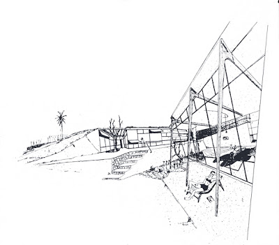
Cave House Part 2 by Ralph Rapson and David B. Runnells


Here are a few more Rapson sketches of the Cave House by Ralph Rapson and David B. Runnells. Again we see that great Rapson hand at work. As always in Ralph's perspectives, you have to love the caricatures of people he added to his drawings.

Thanks again to Ralph's son, Toby Rapson and Grandson, Lane Rapson of Rapson Architects for giving us permission to use these images.

For more images like these read, Ralph Rapson: Sixty Years of Modern Design by KCMODERN friend, Jane King Hession.

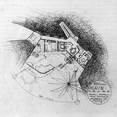
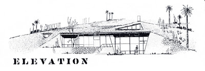
Cave House by Ralph Rapson and David B. Runnells


Another competition entry was put together by Rapson and Runnells in 1939 for a "Cave House." This foray into the earth sheltered or earth contact genre may have been 35 years ahead of its time. It wasn't until the mid-1970's that the idea of a passive solar, earth sheltered design would come into the mainstream consciousness.

The design also featured a modular, self contained service unit, holding the homes heating, water heating and bathroom functions all in one factory made unit. An improved version of this service unit idea would continue on with another Rapson-Runnells partnership called the Fabric House.
It is clear that the plan of this house was also heavily influenced by Finnish Architect, Alvar Aalto. This would be expected of students in the studio of Finnish immigrants, Eliel and Eero Saarinen, but we also know that Runnells was recently back from Scandinavia. Both Runnells and Rapson were known to be found of the work of Aalto, especially his furniture.

Special thanks to Ralph's son, Toby Rapson and Grandson, Lane Rapson of Rapson Architects for giving us permission to use these images.

For more images like these read, Ralph Rapson: Sixty Years of Modern Design by KCMODERN friend, Jane King Hession.

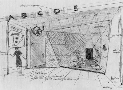
Kawneer Store Front of Tomorrow Design Competition, the Sequel


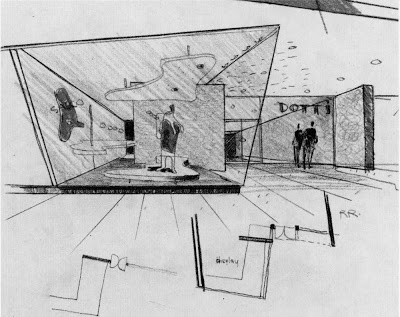
Here are a few sketches by Ralph Rapson of the Kawneer Store Front of Tomorrow Design Competition that he and David Runnells submitted. I think that the influences of Alvar Aalto are even more apparent in these sketches than the final presentation we showed previously. The bundled column to the right of the first drawing and the biomorphic, free form, floor platform and dropped ceiling are right out of the Aalto design vocabulary. I also really love the sketches by Ralph Rapson. He had an amazing hand.

Special thanks to Ralph's son, Toby Rapson and Grandson, Lane Rapson of Rapson Architects for giving us permission to use these images.

For more images like these read, Ralph Rapson: Sixty Years of Modern Design by KCMODERN friend, Jane King Hession.

Kawneer Store Front of Tomorrow Design Competition by Ralph Rapson and David B. Runnells


In 1939, while attending Cranbrook and working in the Saarinen offices David B. Runnells and Ralph Rapson were teaming up and doing architectural competitions. One of these competitions was the Kawneer Store Front of Tomorrow Design Competition. Their joint effort yielded them a honorable mention with the heavyweight jury, which included retail architecture giant, Morris Ketchum and Bauhaus Architect, Mies van der Rohe. My favorite part of the design was that it was to have a translucent structural plastic ceiling with adjustable louvres that were controlled by a solar electric eye and by the heating and electrical system controls. The louvers were meant to act as insulation, light and heat reflectors and blackout blinds.

The full color brochure of the winning projects reported:

Honorable Mention

Ralph Rapson and David Runnells designers, Bloomfield, Mich.

In contrast to the First Honorable Mention, the design was not only competent but brilliant to the point of fussiness. The group shopping lobby, the store front and free-standing displays, the large 'controlled lettering,' the small scale signs, the structural details, and choice of materials are excellent.

"In particular, the jury liked the detailed store front -- where the 'open-faced' shop is partly hidden by a screen wall used as a background for the show window. Often an open interior may reveal that the store is empty of customers, thus scaring away possible shoppers. Here the partial openness gives and interesting glimpse of the interior combined with a good foreground."

"However, the designers did not know when to quit. Their plan, with its elaborate system of angular walls and glazing is as 'busy' as the strained tilting of the same walls in elevations."

"The designers apparently assumed a parking lot to the western end of the store group plot; this was considered permissible within the program."

Rapid Rocker by Ralph Rapson

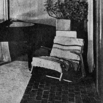
The image above is a 1950's photo of the Ralph Rapson designed Rocking Chair that David B. Runnells owned in his home in Fairview, Kansas. If I had to guess, I would say that it is draped over with a Swedish or Scandinavian wool weaving. The rocker is still in the family and is owned by David's daughter Jill.

The rocker is even more significant because Runnells and Rapson worked on several design competitions together while they were both working in the Saarinen offices in Michigan. In fact, the earliest version of the rocker was done for The Museum of Modern Art, "Organic Design in Home Furnishings Competition," 1940-41, while Rapson and Runnells were working together on other competition projects. More on that later. One would asssume that this furniture purchase was a little homage to his friend Ralph.


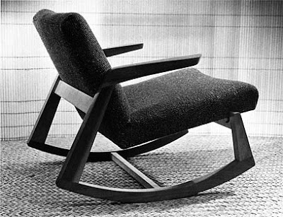
Ralph Rapson. Rocking Chair for the "Organic Design in Home Furnishings Competition," The Museum of Modern Art. 1940-41. Black painted frame, reupholstered with linen webbing 32 x 28 3/4 x 39"; seat h. 14 3/4". Collection Ralph Rapson.

Manufacturer: Knoll
Name: (Rapson) Rocking Chair
Designer: Ralph Rapson
Model Number: 57 U
Production: 1945-46
Dimensions: Unknown.
Materials: Birch frame with fully upholstered seat and back
Photo by:
Ralph Rapson

The image above is photo of the rocker design as it looked when it was in production with Knoll as a part of the Knoll "Rapson Line." The rocker was one of eight products introduced by Rapson. I scanned this image from a 1945 Knoll catalog. This is the "solid wood" version that Runnells owned and the version that Knoll sold at Bloomindales. Bloomingdale's took out a full-page ad in the New York Times to promote the chair, proclaiming it an "innovative and attractive modern take on a traditional piece."

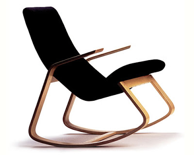
More recently, a bentwood version of the design has been released to the public and is still in production. The chair is based on sketches from 1942 that are obviously done after the MoMA design, but predate the 1945 Knoll "solid wood" production. A bentwood prototype version of the Rapsin Rapid Rocker was shown in a 1951 photograph in the book, Rapson: 50 years of Modern Design. This newer bentwood design is now available from the Wieler Store and Highbrow Furniture.
To ensure that the chair meets the architect's original standards of quality, production is being overseen by Rapson Architects of Minneapolis, MN. The maple frame is finished with two coats of clear lacquer. The seat is upholstered with a high-quality polyolefin fabric. The fabric resembles wool and is is exceptionally tough and stain-resistant. The chair's dimensions are 26.25" wide, 35" high, and 33.25" deep, with a weight of about 30 pounds.

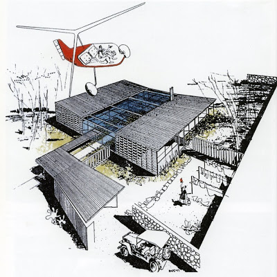
Case Study House No. 4, Greenbelt House by Architect, Ralph Rapson

Name: Case Study No. 4, Greenbelt House
Architect: Ralph Rapson
Year Designed: 1945
Builder: Unbuilt
Year Completed: Unbuilt
Size: 1800 sq.ft including enclosed courtyard space
(living, dining, kitchen, 3 bedrooms and 2 baths)
Location: Hypothetical urban lot
Type: Residential
Style: Modern
Status: Unbuilt
Illustrations: Drawn by Ralph Rapson, found in various online sources.

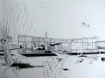
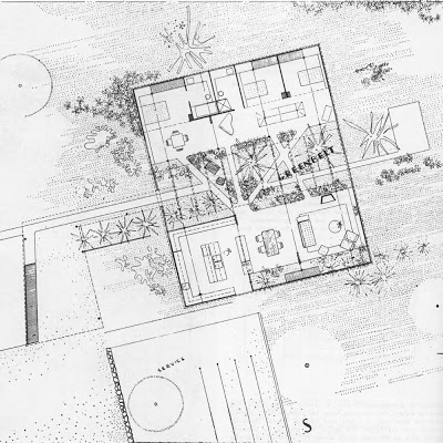
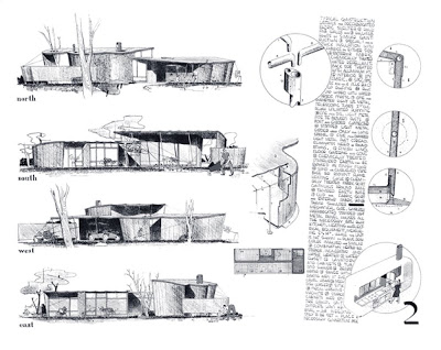
Ralph Rapson was one of only two Architects from outside of California to be tapped to design a Case Study House for John Entenza's Arts+Architecture Magazine. Case Study House No. 4 was as boldly modern as any of the California designed and built studies. Unlike its siblings, Case Study No. 4 was designed for a more urban lot and thus had a more introverted design. It focused its attention to an interior courtyard space instead of focusing outwards to a great landscape or view. The house was made up of two pavilions, one for sleeping and one for living, bisected by a glass covered courtyard. Rapson named this central space the Greenbelt. The design was to have either a wood or steel frame and standardized wall panels

Light and heat were to be controlled in the glass roofed courtyard with adjustable louvers, a theme explored by Rapson with David B. Runnells a few years earlier in the Kawneer Storefront competition. Some design sketches also suggest that the roof might be passively cooled with water ponds or sprinklers, another reoccurring theme with Runnells and Rapson.

Rapson was known for adding such whimsical touches as jeeps, commuter helicopters and caricaturized people to add life to his renderings.

Rapson did finally get this design built in 1989, for an indoor exhibit, Blueprints for Modern Living: History and Legacy of the Case Study Houses at the Los Angeles Museum of Contemporary Art. Rapson passed away on March 29 2008. He was still practicing architecture the day before his death at the age of 93.

David B. Runnells Residence - Architects House Themselves Update - The Self-Cooling House

After I posted about the David B. Runnells Residence, designed for himself and his family, I got a phone call from Jill (Runnells) Grose. I met her again last week, our third or fourth meeting. Thanks to her, we have some great additional information about the now demolished house her father designed for his family. The article and photos were published in the New York Times Magazine on July 26, 1953. I have reposted a couple of the images because they were larger and better quality images and I wanted to include the captions from the recently found article. The magazine touts the advantages of natural ventilation over 1950's advances in home air conditioning. Here is a the article:

Self-Cooling House
by Cynthia Kellogg

Kansas City, MO- Despite the rapid increase in the number of completely
air-conditioned homes (an estimated 50,000 this year), natural methods of
cooling a house should not be overlooked. A new example of such a
“self-ventilating” home is pictured on these pages. Oriented on its plot
to take advantage of the prevailing winds, it was designed by Architect David
Benton Runnells for his family and is located in near-by Mission, Kan., where
summers are hot. Mr. Runnells used many architectural details, such as
piercing walls with many doors and apertures to aid the air flow, as well as a
simple decorating scheme to achieve a cool atmosphere. To reduce the
temperature of the living room, the roof, which can be used as a sun deck, has
been insulated with aluminum foil and, on hot days, can be flooded with water.
--Scanned from New York Times Magazine, July 26, 1953--

Here are the photos with their captions included under each photo:

OVERHANGING ROOF shields house interior at right, designed by David Benton Runnells, from the sun's heat. Screened gallery on upper level permits free flow of air through bedroom windows and doors which open into it.


BREEZEWAY, shown below, circulates air beneath bedrooms to help cool them. Heating and laundry units are in room on right, seperated from the body of house. Front door, upper left, is at the end of gangway-like walk.

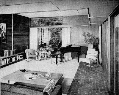
TEXTURES are contrasted, rather than colors, to give cool look to living room at left. Brick "traffic lane" cuts across cork floor under rug. Cool fluorescent light is concealed in a wood strip above picture window. (Editors note: Someone used a little mid-century photoshop on this photo to edit the outside view thru the sliding glass door. Compare this to the previously posted image!)

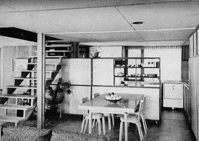
OPEN FLOOR PLAN aids in ventilation, as below. A low storage wall, over which air can pass, separates the kitchen from the dining/living area. Open stairway encourages airflow in to television room at left.

BUILT-IN STORAGE units used throughout the house reduce amount of furniture to a minimum. The television set and radio are contained within this wall.

DOOR, a narrow version of the French window, is used more to admit air than as an exit. Birch cabinets and matching wood funiture contrast with redwood walls.

OVEN, right foreground, is a separate unit built into storage wall away from work area. Burners, more often used, are fitted into counter top at end of kitchen.

APERTURE in walls in corner of bedroom permits flow of air from the rest of the house. Light within the opening also illuminates the stairwell on other side.

David B. Runnells Residence - Architects House Themselves

Name: Runnells Residence
Architect: David Benton Runnells
Year: Designed circa 1950
Year Completed: circa 1950
Size: unknown sq. ft. 3 bedroom 1 1/2 bath
Location: Windsor Street, Fairway, Kansas
(Greater Kansas City Area)
Type: Residence
Style: Modern / International Style
Status: Demolished
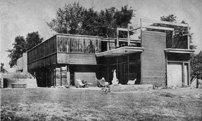
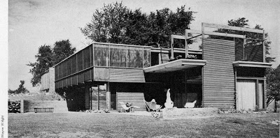
Photographer Wayne Wright, taken circa 1951
Scanned from Architectural Record, February 1955

This Residence was built by David B. Runnells for himself, his wife and two children. It was located on a golf course lot in Fairway, Kansas and was near a few other houses of his design. The plan would suggest certain Scandinavian influences, while the exterior appears that Mr. Runnells may have been influenced by the work of R.M. Schindler. We can also see some relationship to the work of George Matsumoto who had partnered with Runnells just after World War II.
Runnells traveled extensively in Europe on a Scholarship after college and we see in the photos that he furnished the home with many pieces of Alvar Aalto furniture, which he first saw while in Finland in 1936. The Ralph Rapson Rocker pictured is significant because Runnells attended Cranbrook and worked in the Saarinen office with Rapson.

Sadly, the home was torn down in the 1980's and replaced with a French Country McMansion.

Be sure to tour some of the remaining homes by David B, Runnells at KCMODERN's,
David Benton Runnells House Tour and Party.

We will feature at least six Modern Houses by the architect. The dates of the events are
September 19, 2009 for the Runnells House Party and
September 20, 2009 for the Runnells House Tour.