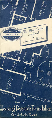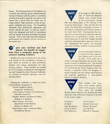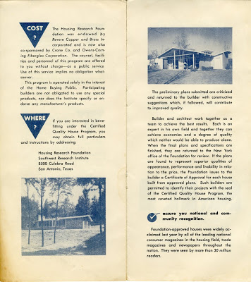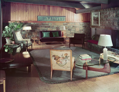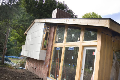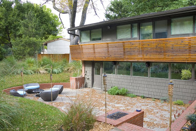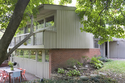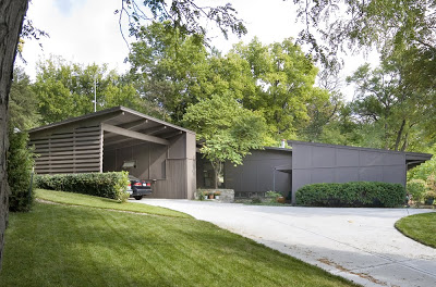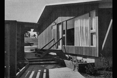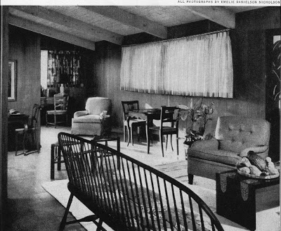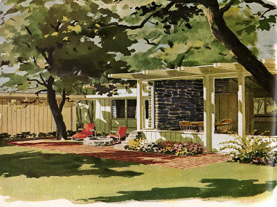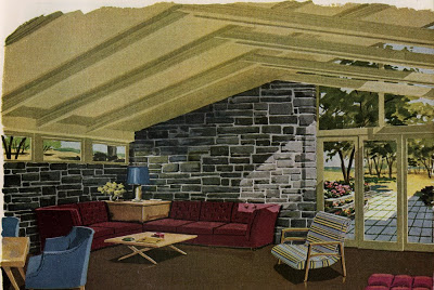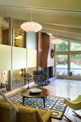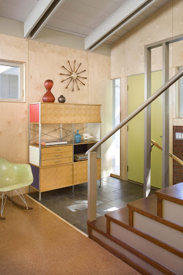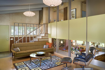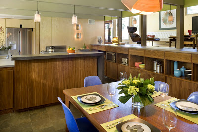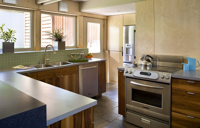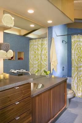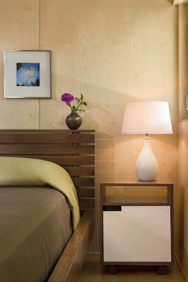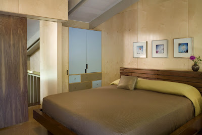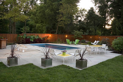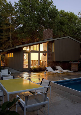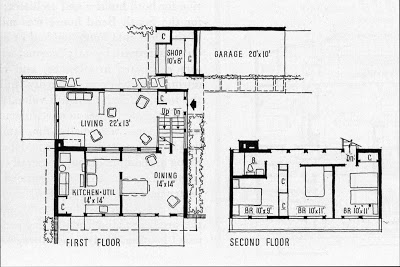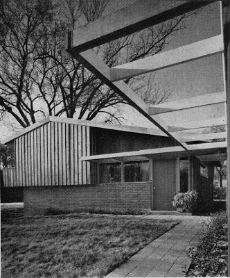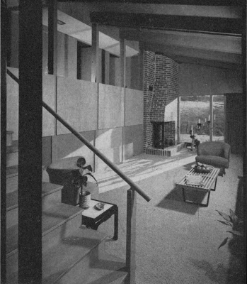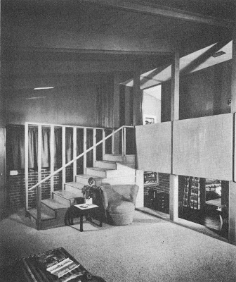
Southwest Research Institute Housing Research Foundation Certified Quality Design - Revere Quality Houses by Don Drummond and Architect David Runnells
Oh yea, I forgot to mention that this brochure was found in one of the boxes that Jill (Runnells) Grose gave to me with her father's documents in them.
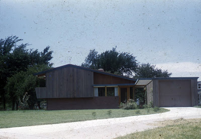
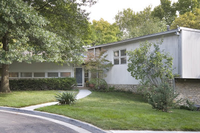
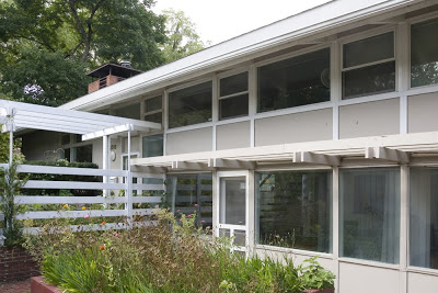
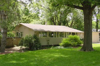
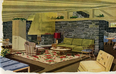
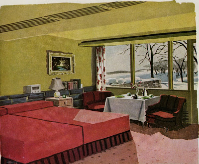
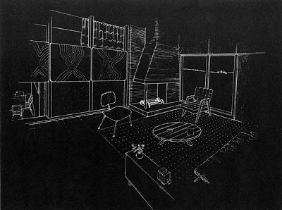
Modern Builder, Don Drummond's Own Home by Architect, David Runnells
Name: Home of Don and Francie Drummond
Architect: David B. Runnells
Year Designed: Circa 1946
Builder: Don Drummond
Year Completed: Circa 1947 or 48
Size: Unknown
Location: Mission Hills KS
Type: Residential
Style: Modern
Status: Demolished
Photographer: Unknown
Sneak Preview of the David B. Runnells Tour this Sunday
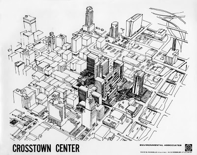
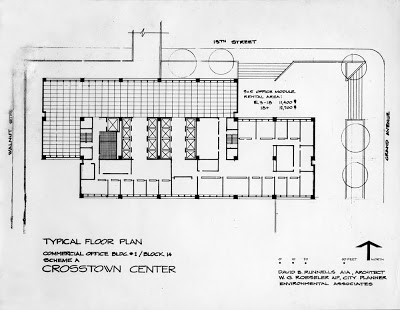
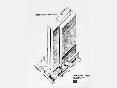
Crosstown Center Proposal by David B. Runnells, Architect & W.G. Roeseler, City Planner
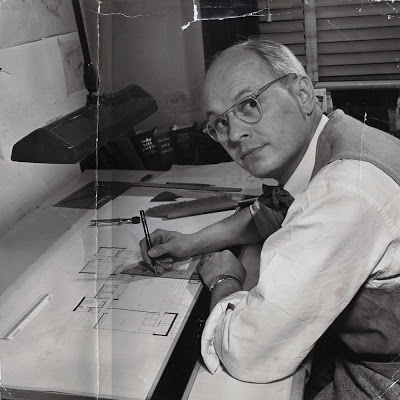
Who is Architect, David B. Runnells?
David Benton Runnells, Architect 1913-1973
Architect, David B. Runnells traveled extensively in Europe after graduating from the University of Illinois. He was heavily influenced by the work of Alvar Aalto while traveling through, Finland and Sweden on a scholarship to the University of Stockholm.
Runnells was a student of Eliel and Eero Saarinen, studying city planning at Cranbrook, a hotbed of modern design education. Other students attending at that time were Charles and Ray Eames, Florence Knoll, Harry Bertoia, Benjamin Baldwin, Harry Weese and Jack Lenor Larsen. Runnells worked in the Saarinen offices during part of World War II and did competitions with co-worker and Case Study House Architect, Ralph Rapson.
Runnells eventually settled in Kansas City sometime around 1941 as head of the industrial design department of the Kansas City Art Institute. He was a director of planning with the Kansas City Planning Department from 1943-46. He became an architect in 1946 and partnered in Runnells Clark Waugh and Matsumoto Architects. Together, they did one of his best known projects, the new Art School building for the Kansas City Art Institute. The only other project known to have come from that partnership is the James I. Clark Residence.
After the partnership dissolved, with Waugh and Matsumoto leaving to teach, Runnells went on to do merchant home builder designs and custom homes, many of which were built by modern builder, Don Drummond. The Revere Homes are his best known merchant builder design. The Reed Residence is the best surviving example of his large custom residential work. The two custom personal residences that he designed for himself and for Don Drummond have both been demolished. His 1966 design for the Alpha Kappa Lambda Fraternity in Lawrence, Kansas has also been demolished.
"Modern Cape Cod" House by Architect, David B. Runnells
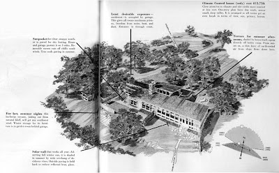
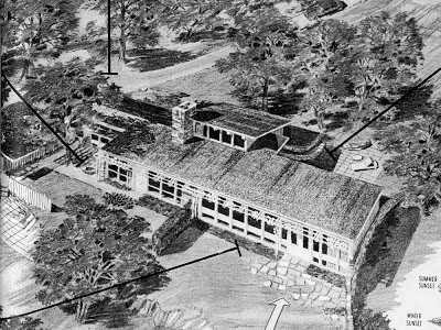
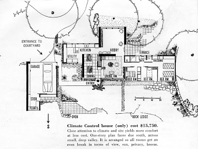
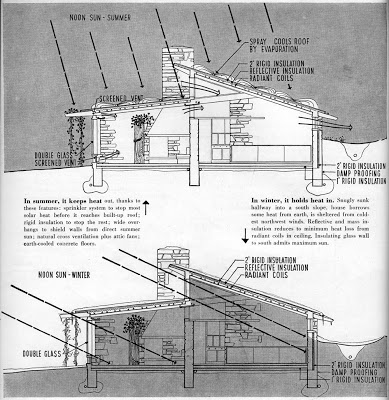
When Mid-Century Modern was Green - A Climate-Wise House for the Missouri River Valley by Architect, David B. Runnells - Part 2
Name: A Climate-Wise House for the Missouri Valley - Stuart Williams Residence
Architect: David Benton Runnells
Year Designed: 1949-1950
Builder: Unknown
Year Built: 1950-1952
Size: Unknown
Location: South Kansas City, Missouri
Type: Residential
Style: Modern, Passive solar heating and cooling
Status: Good
Photographer: N/A
Illustrator: Unknown
Scanned from an article, "If You've Too Much Climate Try Climate Control" and "A Climate-Wise House for the Missouri River Valley" in the May 1950 issue of House Beautiful magazine.
When Mid-Century Modern was Green - A Climate-Wise House for the Missouri River Valley by Architect, David B. Runnells - Part 1
Architect: David Benton Runnells
Year Designed: 1949-1950
Builder: Unknown
Year Built: 1950-1952
Size: Unknown
Location: South Kansas City, Missouri
Type: Residential
Style: Modern, Passive solar heating and cooling
Status: Good
Photographer: N/A
Illustrator: Unknown
Scanned from an article, "If You've Too Much Climate Try Climate Control" and "A Climate-Wise House for the Missouri River Valley" in the May 1950 issue of House Beautiful magazine.
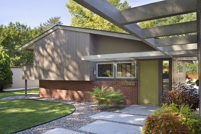
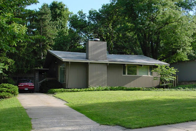
Jerad and Jessica Foster's Revere Home
Jerad and Jessica Foster's Revere Home will be one of the eight homes on tour this weekend. They recently won two KC Home Design, design excellence awards, one gold award in the outdoor category and a silver award in the historic preservation category. Congratulations to Jerad and Jessica. We look forward to your home being on the tour!
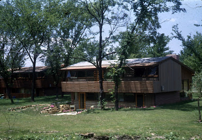
Revere Homes by David B. Runnells
(part of the Revere Quality House Program sponsored
by the Housing Research Foundation that is part of the
Southwest Research Institute, San Antonio, Texas)
Architect: David B. Runnells
Year Designed: 1949
Builder: Don Drummond
Year Completed: 1950-1951
Size: Varies
Location: Prairie Village, KS
Type: Residential
Style: Status:
Photographer: Unknown
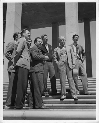
David B. Runnells with Eero and Eliel Saarinen on the Steps of Cranbrook Academy of Art - Photo by "Charlie" Charles Eames - 1941
The Saarinens were powerhouses of design and architecture at that time, winning many architecture competitions and commissions. They also educated and entire generation of the best designers in America at the time. Other students who were there at the same time as David Runnells included: Charles and Ray Eames, Florence Knoll, Harry Bertoia, Benjamin Baldwin, Harry Weese, Ralph Rapson and Jack Lenor Larsen.
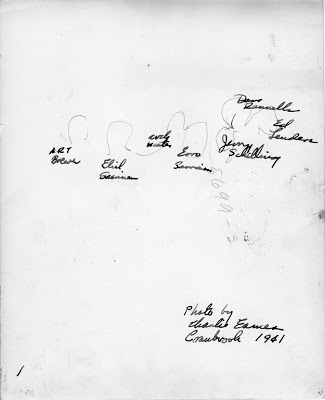
The back of the photo says in script, "Photo by Charlie Eames Cranbrook 1941" (Charles Eames).
The names of the people from left to right appear to be: Ed Leuders, David Runnells, Jamy Schilling, Eero Sarrinen, Carl Water, Eliel Saarinen and Art Breuer.
This photo was loaned to me for scanning by Jill (Runnells) Grose, who is David Runnells' daughter. Jill and her husband Gary will be the guests of honor at the events this weekend.
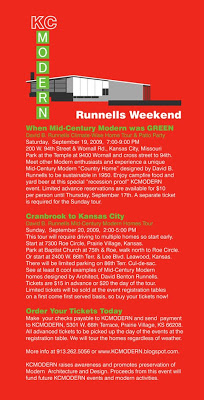
Runnells Weekend Reminder
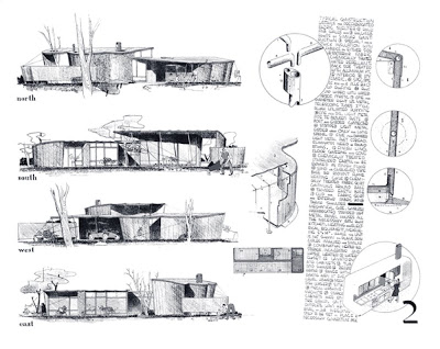
Fabric House Elevations by Architects, David B. Runnells and Ralph Rapson
Rapson’s focus on affordable housing predates the Greenbelt project (Arts+Architecture Case Study House No. 4). ”In the 1930s, David Runnells and I designed an earth-sheltered house we called the Cave House. We also entered another competition with a fabric house, where I made an ill-advised comment that no longer would the architect be necessary because people could simply go to the hardware store, buy their fabric, and roll out their house. Charlie Eames was on that jury, and said that we were thrown out of the competition for that particular comment.”Many thanks to Ralph's son, Toby Rapson and Grandson, Lane Rapson of Rapson Architects for giving us permission to use these images.
For more images like these read, Ralph Rapson: Sixty Years of Modern Design by KCMODERN friend, Jane King Hession.
Fabric House Model by Architects, David B. Runnells and Ralph Rapson
A Fabric House
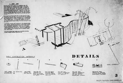
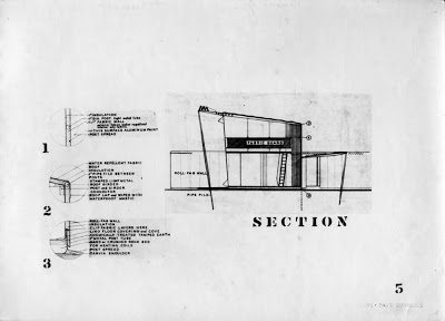
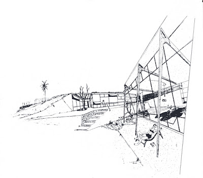
Basically this house is and insulated tent, all roofs and walls are insulated fabric panels that allow the utmost flexibility in planning and design. A completely plastic wall such as this “roll fab wall” permits Mr. A., with a wife, two children, and a particular site and living requirements to practically “mold” his house to suit his changing and varied requirements. While on the other hand Mr. B., a professional man with no children, and entirely different living requirements and site, can, just as easily, with the same material, wrap himself in his own individual shelter.
From this it is easily seen that the basic purpose of the roll fabric wall and roof is to
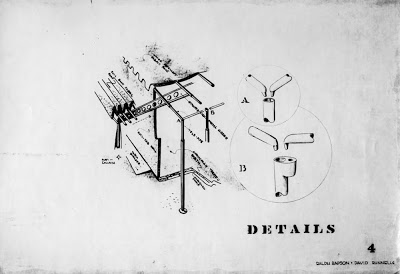
allow absolute and complete planning for infinite human requirements as to construction. The prefabricated roll fabric is placed over a skeleton of light, stamped metal. The structural members are a system of tele-pipe similar to present day airplane sections. A tele-pipe system allows and almost infinite placing of walls and roof.
A mechanical package contains all of the necessary bathroom, kitchen, heating and electrical requirements. Radiant floor heating panels are placed in the floor construction and are completely demountable. Electrical panel boxes, likewise are placed in the floor. The floor is chemically treated tamped earth laid over six inches of crushed rock bed on which any floor covering such as linoleum, canvas, etc., can be laid.
The entire system becomes thus becomes one of maximum planning, maximum economy, maximum demountability.
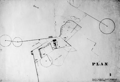
Fabric House Drawings by Architects, David B. Runnells and Ralph Rapson
The plan is obviously influenced by the work of Alvar Aalto and is a conscious derivation of the earlier cave house plan. Note the refinements to the service core which now includes a kitchen.
The project is an interesting interpretation of how we might have dealt with the post World War II housing shortage.
Cave House Part 2 by Ralph Rapson and David B. Runnells
For more images like these read, Ralph Rapson: Sixty Years of Modern Design by KCMODERN friend, Jane King Hession.
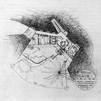
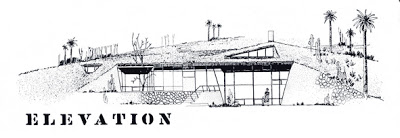
Cave House by Ralph Rapson and David B. Runnells
Another competition entry was put together by Rapson and Runnells in 1939 for a "Cave House." This foray into the earth sheltered or earth contact genre may have been 35 years ahead of its time. It wasn't until the mid-1970's that the idea of a passive solar, earth sheltered design would come into the mainstream consciousness.
The design also featured a modular, self contained service unit, holding the homes heating, water heating and bathroom functions all in one factory made unit. An improved version of this service unit idea would continue on with another Rapson-Runnells partnership called the Fabric House.
It is clear that the plan of this house was also heavily influenced by Finnish Architect, Alvar Aalto. This would be expected of students in the studio of Finnish immigrants, Eliel and Eero Saarinen, but we also know that Runnells was recently back from Scandinavia. Both Runnells and Rapson were known to be found of the work of Aalto, especially his furniture.
Special thanks to Ralph's son, Toby Rapson and Grandson, Lane Rapson of Rapson Architects for giving us permission to use these images.
For more images like these read, Ralph Rapson: Sixty Years of Modern Design by KCMODERN friend, Jane King Hession.
Kawneer Store Front of Tomorrow Design Competition, the Sequel
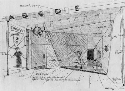
Here are a few sketches by Ralph Rapson of the Kawneer Store Front of Tomorrow Design Competition that he and David Runnells submitted. I think that the influences of Alvar Aalto are even more apparent in these sketches than the final presentation we showed previously. The bundled column to the right of the first drawing and the biomorphic, free form, floor platform and dropped ceiling are right out of the Aalto design vocabulary. I also really love the sketches by Ralph Rapson. He had an amazing hand.
Special thanks to Ralph's son, Toby Rapson and Grandson, Lane Rapson of Rapson Architects for giving us permission to use these images.
For more images like these read, Ralph Rapson: Sixty Years of Modern Design by KCMODERN friend, Jane King Hession.
Kawneer Store Front of Tomorrow Design Competition by Ralph Rapson and David B. Runnells
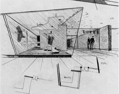
In 1939, while attending Cranbrook and working in the Saarinen offices David B. Runnells and Ralph Rapson were teaming up and doing architectural competitions. One of these competitions was the Kawneer Store Front of Tomorrow Design Competition. Their joint effort yielded them a honorable mention with the heavyweight jury, which included retail architecture giant, Morris Ketchum and Bauhaus Architect, Mies van der Rohe. My favorite part of the design was that it was to have a translucent structural plastic ceiling with adjustable louvres that were controlled by a solar electric eye and by the heating and electrical system controls. The louvers were meant to act as insulation, light and heat reflectors and blackout blinds.
The full color brochure of the winning projects reported:
Honorable Mention
Ralph Rapson and David Runnells designers, Bloomfield, Mich.
In contrast to the First Honorable Mention, the design was not only competent but brilliant to the point of fussiness. The group shopping lobby, the store front and free-standing displays, the large 'controlled lettering,' the small scale signs, the structural details, and choice of materials are excellent.
"In particular, the jury liked the detailed store front -- where the 'open-faced' shop is partly hidden by a screen wall used as a background for the show window. Often an open interior may reveal that the store is empty of customers, thus scaring away possible shoppers. Here the partial openness gives and interesting glimpse of the interior combined with a good foreground."
"However, the designers did not know when to quit. Their plan, with its elaborate system of angular walls and glazing is as 'busy' as the strained tilting of the same walls in elevations."
"The designers apparently assumed a parking lot to the western end of the store group plot; this was considered permissible within the program."