Kansas City Design Week - February 4-11 2011

Please join KCMODERN in supporting Kansas City Design Week, February 4-11, 2011. KCMODERN will be planning and executing four great tours featuring Kansas City Design on Saturday, February 5, 2011. But don't just participate in the tours. There are a whole week of events and we are sure that you find a at least a few that will appeal to you!

www.kcdesignweek.org


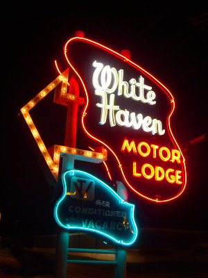


So long White Haven Motor Lodge - Modernism at Risk on Metcalf

I am ashamed to say that I have had a series of posts planned about the Metcalf strip that included the White Haven Motor Lodge for over a year. Time and energy have worked against me lately on getting these posts adequately researched and photographed.

Unfortunately it is now time to say goodbye to the White Haven Motor Lodge. The sign and all of the contents of the motel will be sold this week at auction. Demolition of the motel is probably inevitable at this point. Sad to think that in this economy demolition will happen so that a vacant lot can sit there for another five years or more.

I wonder if any traction can be gained to purchase this sign and keep it in the area where it belongs!

Kansas City Star Magazine does feature on 60's Modern Architecture

photo by shane keyser | the star


Visit photo gallery here

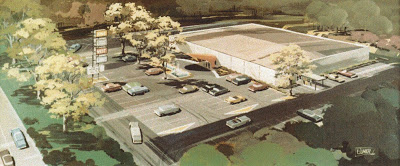
Manuel Morris- Architect - King Louie West

The other day I drove by the old King Louie West, now called the AMF West Lanes, and saw that it was for sale...it reminded me of when I met the architect, Manny Morris. He was considering selling his home in Prairie Village, Ks. and a later meeting when we sat down to discuss his work...interesting man that did some cool work in Kansas City, but in his later years very cold to your interest in it. He lent me these architectural aerial renderings to copy.
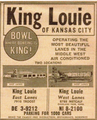
King Louie was built in two phases; the original building was designed by Manuel Morris and Associates in 1948. There was a lot of green space in the area at the time! Overland Park didn't become a city until 1961. The 32 lane bowling alley was a rectangular white masonry building with a hovering red "thin-shell" canopy facing east. The block structure is still visible at the rear of the building. The original sign remains in this place today.


Thin shell canopies were a hallmark of the architect's early work. My friend(fellow blogger) and architect, Robert from MCLAUGHLINDESIGN said, "The tilted arch canopy formed an entry scoop towards the parking lot facing Metcalf Avenue and was the only thing that articulated this low windowless box. This was a unique biomorphic touch, which gave a nod to parabolic structures that were popular at that time." A modern sculpture and entry fountain further marked the entry area, but these features were obscured by the later ice skating rink addition.


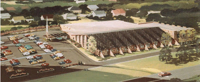
In the mid-sixties, the owners, the Lerner brothers, contacted the original architect, Morris and his associate, Robert E. Sixta, to design an addition, with a billiards room, locker room and an ice skating rink.


Morris said regarding the addition, "we tried to stay away from the commercial building look, and tried to find warmth and a casual feel for a fun-time place." As you can see from the rendering below the entry has been moved to the south of the building and ample parking has been added, it appears that the current parking lot is larger than the footprint of the building, a testament to the days before home video games...we all went to King Louie!
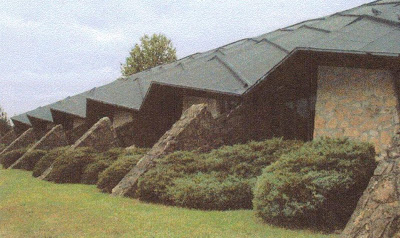
The distinctive folded plate roof was designed to "hide the mass of what was under it," Morris added. You can see this same approach in the architect's work on the Jewish Community Center, at 94th and Wornall, KCMO. By sinking the large ice skating rink below grade, the architect was further able to disguise the mass of the addition relative to the low original building...you might recall, when it was built, the roof on the ice rink was covered with volcanic stone aggregate. The interior of the newer ice rink is highlighted by a dramatic free spanning wood strucure that frames the buildings folded roof. This structure prompted the rinks nickname "The Ice Chalet"...the skating rink floor, etc. was removed a few years ago.
This buiding is a rare remaining example of Googie architecture in Johnson County, Kansas. When asked about the style of the building the architect added, "there was definately a Frank Lloyd Wright influence in shapes, materials and the metal and stone spire at the entrance." The informed observer can see the influences of Frank Lloyd Wright's Taliesin West and the spire of Wright's Marin County Civic Center. The building in it's present form was completed in 1965. Let's hope it has a great future and survives the proposed "remaking" of the Metcalf corridor!


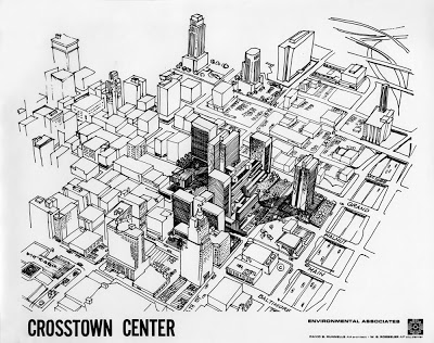
Crosstown Center Proposal by David B. Runnells, Architect & W.G. Roeseler, City Planner

Not much is known about this unbuilt urban renewal project, except that it was to be located roughly where the Power and Light District is now near the Sprint Center Arena and that it was designed by Environmental associates which was a partnership between David Runnells, AIA, Architect and W.G. Roeseler, AIP, City Planner. The project demonstrates early 70s style semi-brutalist architecture not unlike the built Crown Center urban renewal projects.

Kawneer Store Front of Tomorrow Design Competition, the Sequel


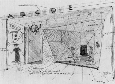
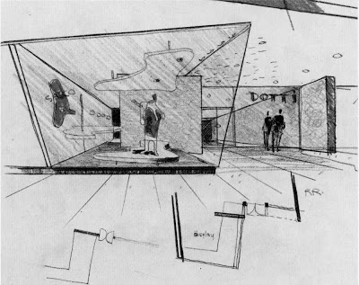
Here are a few sketches by Ralph Rapson of the Kawneer Store Front of Tomorrow Design Competition that he and David Runnells submitted. I think that the influences of Alvar Aalto are even more apparent in these sketches than the final presentation we showed previously. The bundled column to the right of the first drawing and the biomorphic, free form, floor platform and dropped ceiling are right out of the Aalto design vocabulary. I also really love the sketches by Ralph Rapson. He had an amazing hand.

Special thanks to Ralph's son, Toby Rapson and Grandson, Lane Rapson of Rapson Architects for giving us permission to use these images.

For more images like these read, Ralph Rapson: Sixty Years of Modern Design by KCMODERN friend, Jane King Hession.

Kawneer Store Front of Tomorrow Design Competition by Ralph Rapson and David B. Runnells


In 1939, while attending Cranbrook and working in the Saarinen offices David B. Runnells and Ralph Rapson were teaming up and doing architectural competitions. One of these competitions was the Kawneer Store Front of Tomorrow Design Competition. Their joint effort yielded them a honorable mention with the heavyweight jury, which included retail architecture giant, Morris Ketchum and Bauhaus Architect, Mies van der Rohe. My favorite part of the design was that it was to have a translucent structural plastic ceiling with adjustable louvres that were controlled by a solar electric eye and by the heating and electrical system controls. The louvers were meant to act as insulation, light and heat reflectors and blackout blinds.

The full color brochure of the winning projects reported:

Honorable Mention

Ralph Rapson and David Runnells designers, Bloomfield, Mich.

In contrast to the First Honorable Mention, the design was not only competent but brilliant to the point of fussiness. The group shopping lobby, the store front and free-standing displays, the large 'controlled lettering,' the small scale signs, the structural details, and choice of materials are excellent.

"In particular, the jury liked the detailed store front -- where the 'open-faced' shop is partly hidden by a screen wall used as a background for the show window. Often an open interior may reveal that the store is empty of customers, thus scaring away possible shoppers. Here the partial openness gives and interesting glimpse of the interior combined with a good foreground."

"However, the designers did not know when to quit. Their plan, with its elaborate system of angular walls and glazing is as 'busy' as the strained tilting of the same walls in elevations."

"The designers apparently assumed a parking lot to the western end of the store group plot; this was considered permissible within the program."
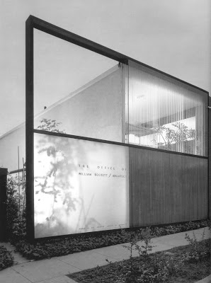
Offices of William S. Beckett, Architect - Case Study House Era Architect - Mid-Century Modern Architecture
Name: Offices of William S. Beckett, Architect
Architect: William Sutherland Beckett
Year Designed: circa 1949-50
Builder: Unknown
Year Completed: 1950
Size: Unknown
Location: 9026 Melrose Avenue, Los Angeles, California
Type: Office
Style: Modern
Status: Standing in unknown condition
Photographer: Julius Shulman

William S. Beckett began his professional career as chief designer for Sumner Spaulding, the architect of Case Study House #2 for Arts + Architecture magazine. Around that time he was also on the faculty at the University of California.

By 1949, William S. Beckett had opened his own architectural practice in Los Angeles. In 1951, he designed his own architectural offices located at 9026 Melrose Avenue. The magical black and white Julius Shulman photographs of this building were widely published in the architectural press. The building garnered him an AIA National Honor Award, First Award in 1952, one of only three given nationwide that year. This prestigious award made his reputation as one of the architects of the stars and Beckett set off on a career designing many celebrity homes in Beverly Hills and other exclusive neighborhoods in LA. The new posh international style modernism of the office set the tone for his designs for his A-list clients. This small modern office building is still standing today.


Julius Shulman - Oklahoma Modernism Rediscovered - April 30 through June 7

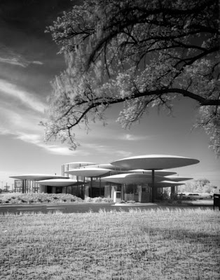
Organized by the Oklahoma City Museum of Art, Julius Shulman: Oklahoma Modernism Rediscovered is the first-ever retrospective of photographs taken in Oklahoma by legendary architectural photographer Julius Shulman. The exhibit runs from April 30 through June 7 and will feature over 65 images - many unseen by the public for decades - of buildings designed by such world-renowned architects as Bruce Goff, Herb Greene, William Caudill, Truett Coston, Robert Roloff, and Paul Harris. Twenty-one architectural projects from six Oklahoma cities and towns will be represented in the exhibition, including homes, banks, churches, museums and hospitals.
In addition, on Saturday, May 2, the Museum will sponsor an architectural bus tour of several Oklahoma City-area buildings that Shulman photographed during the years he worked in Oklahoma.

Foley Tractor, by Architect, W. I. Fisher, Wichita, Kansas - Then and Now

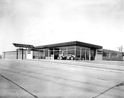
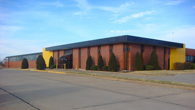
Here is a vintage photo of a landmark Wichita, Kansas business, Foley Tractor. Now known as Foley Equipment, the original building by Architect, W. I. Fisher, displayed that wonderful everyday modern commercial style that is disappearing so fast. This one is close to my heart because I rode by this one often when I was a kid. It was just down West Street from the Wichita John Deere dealer in a similar building that my dad visited frequently. I borrowed this estate sale photo from KCMODERN friend, Keith Wondra's Flickr site, kawwsu29. He was kind enough to let us use it.

THEN -- I love how the large expanses of glass act as a billboard for the sale of the Caterpillar industrial equipment displayed in the showroom. Can you imagine driving by at night when the brightly painted, industrial yellow equipment was lit up behind that glass? The neon Caterpillar sign over the exposed steel canopy at the entrance was a nice touch too!

NOW-- It appears that a 1970's brick redo was done to the glass parts of the facade. This was probably done because the large expanses of south and west facing glass caused the showroom space to overheat in the summer. You can see that the industrial steel window sash is still intact in the left background. This is probably a shop area and might be older than the vintage showroom.
INTERIOR -- The vintage interior was clean and modern too. I bet they no longer display Caterpillar equipment in there since the equipment has gotten much larger and it appears that the overhead door is no longer there. The business was already closed for the evening so I didn't get a new shot of the interior.

Modernism at Risk - Kivett and Myers

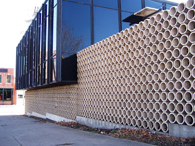
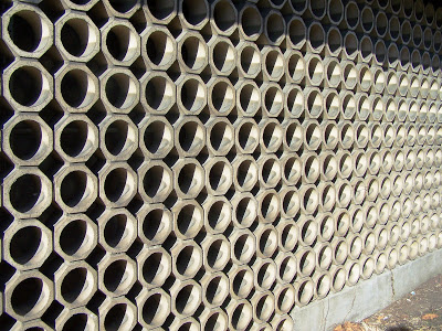
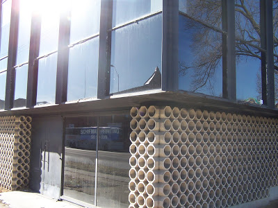
I was in the Crossroads area of Kansas City, MO the other day when I saw the Kivett and Myers and McCallum designed commercial building in the Mies Van Der Rohe manner, with clean lines and walls of glass. . .
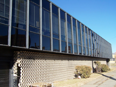
I stopped, got out of the car and took theses snapshots of the building. Click on images to enlarge.Upon closer inspection, I could see deteriorating elements such as cracked and missing blocks on the "light and shadow" lower facade. . .Many metal frames are rusted and up close you can see the differed maintenance. This is a great looking little building done in 1961. Sorry for this last shot, the sun wasn't cooperating. I wanted to show the juncture of the tiles and the way the tile wall kind of makes your eyes vibrate. Note the door with cool handles.It looks as if it feels taken for granted, so many cars pass by daily. We can ill afford to lose another K & M designed building. We should be celebrating K & M buildings, but unfortunately we've watched some of them deteriorate and/or get torn down.
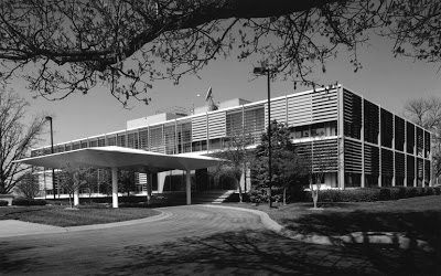
Modern Photo of the Week - Missouri Public Service

Name: Missouri Public Service
Architect: Kivett and Myers
Year Designed: circa 1955
Builder: Unknown
Year Built: 1956
Size: Unknown
Location: Raytown, MO
Type: Commercial
Style: Modern
Status: Endangered
Photographer: Brad Finch
http://www.f-stop.com/

You may be beginning to notice that I love the work of Kivett and Myers. This is my favorite remaining building by that firm. I just love the sun louvers, which operated automaticaly and I think that the building has a timeless quality to it. You can go into the architectural journals of today and see many architects trying to achieve a similar aesthetic.

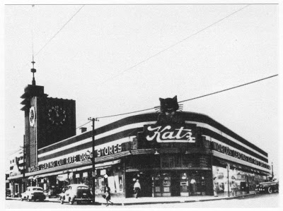
Bonus Modern Photo of the Week - More of Katz Drug

Since we missed posting a photo of the week last week and since we are on the topic of Katz Drug, I thought that I would present you with this vintage image of the mid-town Katz. Don't you just love that neon sign? I would love to see a color shot of that Katz Cat lit up. See the image below for the details on this building.
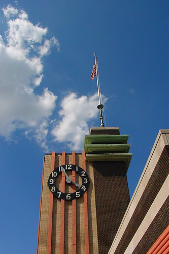
Modern Photo of the Week - Katz Drug

Name: Katz Drug
(most recently Osco Drug, before that it was a Skaggs Drug)
Architect: Clarence Kivett
(Later a Partner in the firm, Kivett and Myers)
Year Designed: 1934
Builder: Unknown
Year Built: early 1934
Location: Main Street & Westport Road, Kansas City, MO
Type: Commercial Retail
Style: Streamline Moderne, Art Deco
Status: Unoccupied, For Sale and Endangered
Photo by: Robert McLaughlin

The premiere Katz Drug Store (#9) location at Main and Westport Road was about to be the setting for the latest crime against Modern Architecture in Kansas City. The recent purchase of the Osco Drug chain by CVS Drugs, and the proximity to another CVS drugstore, had left that location's future in question.

The midtown location was one of the first buildings designed by Clarence Kivett in 1934 and it became the first in long line of buildings designed by Kivett and Myers for the Katz Drug chain, owned by Kivett's uncles, Isaac and Michael Katz. It seems that particular building has received a stay of execution as CVS has not sold the building yet and it has recently been successfully added to the U.S. National Register of Historic Landmarks.

This building is a wonderful demonstration of the late Streamline Moderne Style. Alan Hess, architect and author of Googie called it a classic example of "building as billboard," with its masonry and neon clock pylon marking Main Street for miles in either direction.

Modern Photo of the Week - KG&E Building Wichita, Kansas

Name: KG&E Building, Kansas Gas and Electric Company
Architect:
Year Designed: Unknown
Builder: Unknown
Year Built: 1954
Location: Wichita, Kansas
Type: Office Building
Style: International Style
Status: Standing, but altered
Photographer: Howard Eastwood from
http://www.wichitaphotos.org/

I do not know much about this building, but I cannot help thinking that the designer was well aware of the work of William Lescaze, the designer of the PSFS Building in Philadelphia, the first International Style skyscraper. I recall being amazed by the KG&E building as a child when going with my mother to a meeting in one of the conference rooms. She worked for another electric company as a home economist, teaching women how to cook on their new electric stoves. The thing that was the most memorable to me was the lighting fixtures and aluminum detailing in the lobby and on the exterior of the ground floor. I wonder if that is still there.