Kansas City Art Institute - Art School by Runnells Clark Waugh and Matsumoto Architects - Part 2

Name: Kansas City Art Institute - Art School
Architect: Runnells Clark Waugh and Matsumoto Architects
Year Designed: circa 1945-46
Builder: Unknown
Year Built: circa 1947-48
Size: Unknown
Location: Kansas City, MO
Type: Education
Style: Modern
Status: Fair with multiple additions that obscure major parts and concepts of the original building
Photographed By: Fred Gund
Photos Scanned From: Progressive Architecture February 1949. Art School, Kansas City, Missouri. pp 62-65.
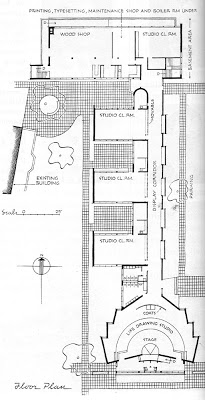
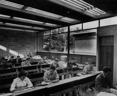
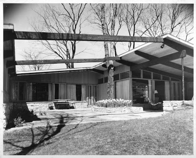
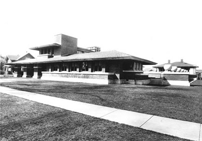
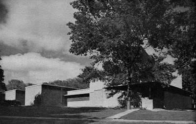
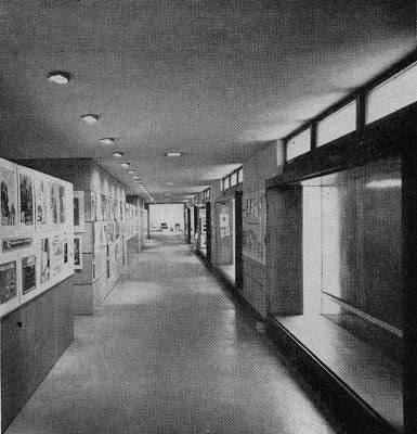
The design concept for the Kansas City Art Institute's new Art School was all about securing natural north light for all of the studio classroom spaces. The studio classrooms were placed on the west side of a single loaded, "display corridor" that acted as a north-south spine. Display alcoves were naturally and artificially lit and placed opposite the studios on the east side of the spine. These alcoves were expressed as projecting boxes on the exterior of the east side of the building. The display alcoves are no longer visible on the exterior or naturally lit because of a recent addition.
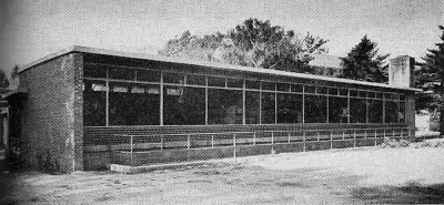
The studio classrooms were the programmatic heart of the building. Each studio classroom had an exterior courtyard space between it and the next studio. These could be used as outdoor work spaces in fair weather. This exterior space between studios allowed natural diffused light to enter each of the studios through a large north facing window wall from the courtyard. Natural ventilation entered through louvers and exited through clerestories. Southern clerestories let light in from the south, while the west facades of the studios were blank brick walls to protect the rooms from the low western sun. Today these courtyards have been filled in to create more interior space.
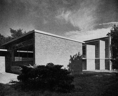

The studio roofs were raised higher than the surrounding corridor and service spaces to accommodate clerestory windows and give that portion of the program a sense of hierarchy. The building was framed in concrete with some steel bar joist roof construction. The frame was then filled with concrete block walls and the exterior of the building was rendered in a vocabulary of red brick, concrete block, limestone and corrugated asbestos cement panels. The interiors were mostly concrete and lightweight concrete block left in a raw unfinished state.
The north end of the spine was punctuated by a two level classroom wing, with a full level below the main floor. The classroom wing housed industrial design studios upstairs and painting, typesetting and service areas downstairs. These rooms all had large north facing windows.
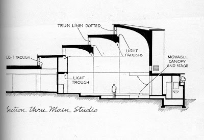
The south end of the spine was marked by the main studio, a life drawing studio done in a sculptural form of contrasting limestone. The stepped trapezoidal plan and section segments allowed for multiple north facing clerestories to light the large complex space, which was designed for 150 people. Today the clerestory windows are covered with sheet metal siding.

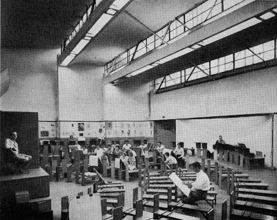
The main stepped form of the life drawing studio was likely inspired by some of Alvar Aalto's work in Finland. We know from Runnells sketch books that he traveled to Finland and certainly would have been familiar with the work. Runnels and Matsumoto's body of work certainly was closely related to Aalto's use of light and "Aaltos Red Brick Period."
The transplanted Finns, Eero and Eliel Saarinen were also very influential on this design. This was because the partners of this firm met at Cranbrook and came out of the Saarinen studio and architectural offices. The plan definitely used the Saarinen designed Crow Island School, with is courtyards between studio classrooms, as a precedent. And there was some relationship to the unbuilt, competition winning, Smithsonian Art Museum design. Even the signature Runnells-red brick chosen for the classroom portion of the building was a nod to the Cranbrook campus.
Besides relating to Cranbrook the red brick with limestone trim was also a tribute to Vanderslice Hall. The limestone cladding of the life drawing studio related to the cladding of the nearby Nelson Atkins.

A 1949 Progressive Architecture article gave this project a P/A Award Special Citation.

This article was written to familiarize our readers with the work of Architect who will be the featured in KCMODERN's David Benton Runnells House Tour, which will be held on September 20, 2009. Watch for more details soon!

William Sutherland Beckett: Architect of the Cliffhanger - Modern Photo of the Week

Name: Three Cliff-side Dwellings
Architect: William Sutherland Beckett
Born in Kansas City
(No relationship to Welton Beckett)
Year Designed: Circa 1960
Builder: Stone Fisher Constructors
Year Finished: 1961
Size: Unknown
Location: Los Angeles, CA
Type: Residential
Style: Modern Cliffhanger
Status: Still Standing
Photographer: Julius Shulman

We have a KCMODERN event coming up on Sunday, June 14 in a Kansas City residence by this same architect. So stay tuned!

Julius Shulman - Oklahoma Modernism Rediscovered - April 30 through June 7

Organized by the Oklahoma City Museum of Art, Julius Shulman: Oklahoma Modernism Rediscovered is the first-ever retrospective of photographs taken in Oklahoma by legendary architectural photographer Julius Shulman. The exhibit runs from April 30 through June 7 and will feature over 65 images - many unseen by the public for decades - of buildings designed by such world-renowned architects as Bruce Goff, Herb Greene, William Caudill, Truett Coston, Robert Roloff, and Paul Harris. Twenty-one architectural projects from six Oklahoma cities and towns will be represented in the exhibition, including homes, banks, churches, museums and hospitals.

In addition, on Saturday, May 2, the Museum will sponsor an architectural bus tour of several Oklahoma City-area buildings that Shulman photographed during the years he worked in Oklahoma.

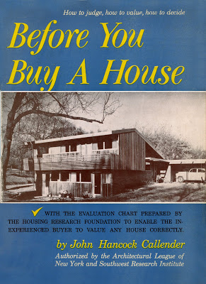
Before You Buy a House by John Hancock Callender

Back in 2004, co-blogger Scott and I went to California to visit with Don Drummond at his home in Carmel, California. After an entire day of chatting about his years building Modern homes in Kansas City, he began to look for some old magazines and books about his projects in KC. He took us to a hall closet, which had some of his wife's books on design and there was this book with the Revere Homes from Prairie Village, KS on the cover. It was called, Before You Buy a House, by John Hancock Callender. My heart skipped a beat with excitement when I saw it. Seeing my enthusiasm, Don offered to give me the book. I resisted the tempting offer, suggesting that he give it to one of his children or grandchildren instead. I did except his offer on another fabulous book, but that is a story for another day. Ironically, I found the same book on the shelf of Stephen Ritchings, another Mid-Century Modern enthusiast and friend in California later that same weekend. Making note of the title, I immediately ordered a couple copies of this rare title from used book sellers upon my arrival back home.

This has proven to be one my favorite titles in my extensive vintage architecture book collection. It has early 1950's homes by many of the great house designers and builders of the time. Most notably. there is extensive coverage of the early Eichler homes by Anshen and Allen and Jones and Emmons in California. Also of note are homes in Hollin Hills, Alexandria, VA by Architect, Charles M. Goodman and Builder, Robert C. Davenport. Closer to home, there are projects in Arapahoe Acres, Denver, CO by Architect, Eugene R. Sternberg and Builder, Edward B. Hawkins.

The book is titled Before You Buy a House: How to Judge, How to Value, How to Decide by John Hancock Callender and authorized by the Architectural League of New York and the Southwest Research Institute. Published by Crown Publishing, New York in 1953.
160 pages, 34 Houses and developments, 211 black-and-white photographs, drawings, and plans, and an Evaluation Checklist prepared by The Housing Research Foundation.

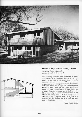
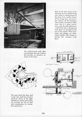
Because some of these homes will be on the upcoming KCMODERN Runnells Modern House Tour I thought I would share this book with you. Here are the pages from the book pertaining to the Revere Home by Architect, David B. Runnells and Builder, Donald H. Drummond.

Bernard Corrigan Mansion by Louis S. Curtiss, Architect - Modern Illustration - Modern Photo of the Week

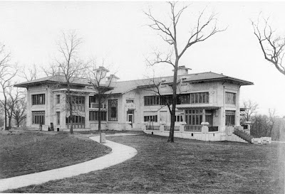
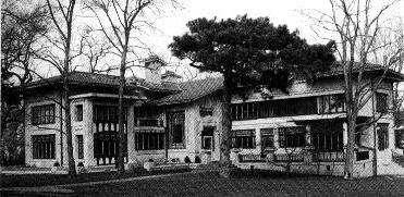
Corrigan residence in final constructio stage, 1913, scanned from Stalking Louis Curtiss by Wilda Sandy and Larry K. Hancks

Bernard Corrigan residence 1200 West 55th, Kansas City, Missouri rendering dated June 22, 1912, scanned from Stalking Louis Curtiss by Wilda Sandy and Larry K. Hancks

Since the Frank Loyd Wright Conservancy is coming to town and this is one of the houses that they are touring, I thought that I would add some images from the book Stalking Louis Curtiss by Wilda Sandy and Larry K. Hancks.

Bernard Corrigan Mansion by Louis S. Curtiss, Architect - "What's the Story on That House?"


Construction on the Bernard Corrigan Mansion started in 1913. Corrigan was successful as a building contractor, street railway developer and real estate investor. His company was the builder of the house. He died before it's completion.
After several short ownerships, the Sutherland family (think lumber) bought the home and lived here for a number of years. It is often called the Corrigan-Sutherland house. Located at 55th and Ward Parkway, the house was built on the southern edge of town at the time (the Plaza Shopping District is dated 1922) The black and white photo was taken in 1940.
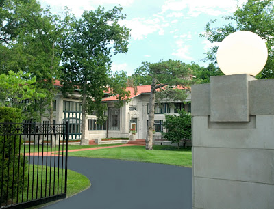
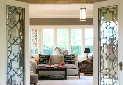
One of the most architecturally distinctive houses situated on one of the most dominant lots in Kansas City, this Louis Curtiss design is a Tour de Force. Curtiss meshed a number of elements creating at first look, the Prairie Style and Frank Lloyd Wright's work. On closer examination one sees Art Noveau masonry relief, Arts and Crafts ornamentation under a mediterranean tile roof. The art glass windows are remarkable.
This unique home was constructed with long span girders and reinforced concrete, unusual for it's day. The craftsmanship is impeccable. The eclectic mix of elements creates a house of subdued exuberance...truly a masterpiece.
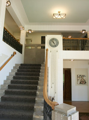
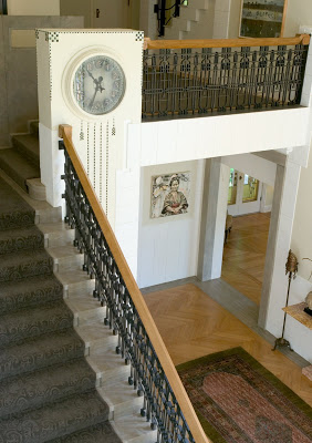
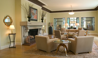
Curtiss was so eclectic...perhaps inspired by Charles R. Mackintosh and Louis Sullivan on the clock and staircase... (recent photos courtesy of Gary Kabrink)

David Benton Runnells House Tour

We have had a few questions since starting the blog asking for information on the house pictured in the header of our blog. We have also been getting a lot of questions about when will we be having the next KCMODERN house tour. Well, we have decided to answer both questions at the same time. The house in the blog header is by Kansas City Architect, David B. Runnells. It is located in Leawood, Kansas (see the info below the photo for more details) and it will be one of the featured homes on the this years tour.

KCMODERN's David Benton Runnells House Tour will feature at least four other houses by the same architect. The date of the event is tentatively scheduled for September 20, 2009.

This years tour will be a little different because we will have multiple locations that will require some driving between house locations. There will be multiple houses to see at some of the locations.

As in years past, we are pursuing opportunities to have an evening festivity with spirits in a special house related to the tour theme. More on that later.

Look for us to start highlighting some work by David Benton Runnells on the blog in the coming weeks and months.
Name: Residence for G. Findlay Reed (original owner)
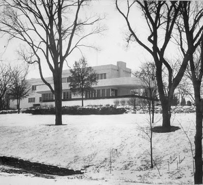
Architect: David Benton Runnells
Year Designed: 1950-1951
Builder: Donald Drummond
Year Built: 1951
Size: Unknown
Location: Leawood, Kansas (Kansas City)
Type: Residential
Style: Modern
Status: Excellent condition with some minor alterations including new sympathetic siding by present owner and a new kitchen by a previous owner.

This house was built with prefabricated panels that were manufactured in a millwork shop with windows pre-installed. The panels were then brought to the site and erected.

Bixby Residence Garden Facade - Bonus Modern Photo of the Week

Name: Walter Edwin Bixby, Sr. Residence
Architect: Edward W. Tanner
Landscape Architect: Hare and Hare
Interior Designer: Kem Weber
Year Designed: 1935
Builder: Unknown
Year Built: 1936-37
Size: Unknown
Location: State Line Road, Kansas City, MO
Type: Residential
Style: Moderne with International Style influences
Status: Exterior excellent; Interior altered
Photographer: Norman Hobart. Courtesy of Leon and Margaret Jacobs via The University Art Museum, University of California at Santa Barbara

See their website here:
Page 1
Page 2
Page 3
Since we have been covering the Bixby Residence here and here, I thought I would go ahead and add this vintage exterior photo of the rarely seen Garden Facade of the house. The cantilevered balcony on the right is much more visible from this view.

Foley Tractor, by Architect, W. I. Fisher, Wichita, Kansas - Then and Now

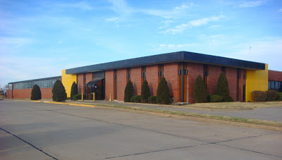
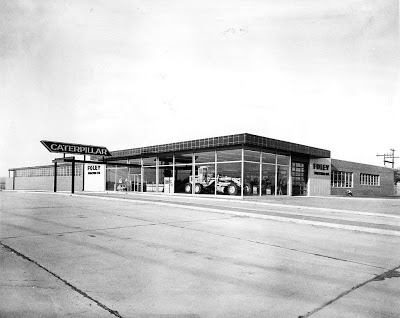
Here is a vintage photo of a landmark Wichita, Kansas business, Foley Tractor. Now known as Foley Equipment, the original building by Architect, W. I. Fisher, displayed that wonderful everyday modern commercial style that is disappearing so fast. This one is close to my heart because I rode by this one often when I was a kid. It was just down West Street from the Wichita John Deere dealer in a similar building that my dad visited frequently. I borrowed this estate sale photo from KCMODERN friend, Keith Wondra's Flickr site, kawwsu29. He was kind enough to let us use it.

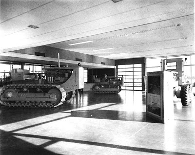
THEN -- I love how the large expanses of glass act as a billboard for the sale of the Caterpillar industrial equipment displayed in the showroom. Can you imagine driving by at night when the brightly painted, industrial yellow equipment was lit up behind that glass? The neon Caterpillar sign over the exposed steel canopy at the entrance was a nice touch too!

NOW-- It appears that a 1970's brick redo was done to the glass parts of the facade. This was probably done because the large expanses of south and west facing glass caused the showroom space to overheat in the summer. You can see that the industrial steel window sash is still intact in the left background. This is probably a shop area and might be older than the vintage showroom.
INTERIOR -- The vintage interior was clean and modern too. I bet they no longer display Caterpillar equipment in there since the equipment has gotten much larger and it appears that the overhead door is no longer there. The business was already closed for the evening so I didn't get a new shot of the interior.

Drummond "Flatties" - The J.C. Nichols Connection


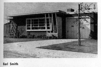
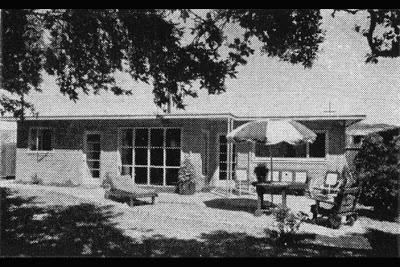
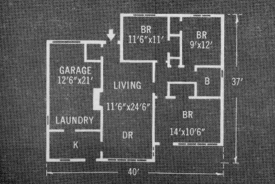
In 1951 Francie Drummond returned from a trip to San Francisco CA. She had seen houses built by, and met, a successful Bay Area home builder named Earl Smith. She liked the way his new house plan functioned. He developed subdivisions and built many homes. Due to the flat roofs on his many houses he was nicknamed "Flat Top" Smith. Joe Eichler, another Bay Area builder/developer started his Sunnyvale Development with house plans obtained from Smith. Here are vintage photos of Smith's model and floor plan, courtesy of Robert. (click on image to enlarge)


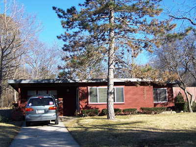
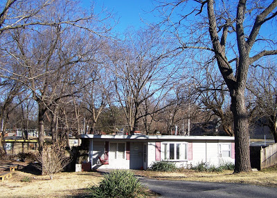
Francie returned home with the plans and Don built the house almost identical to Smith's, only changing; sizes of specific spaces for buyers needs, siding types, using Reynolds Aluminum windows, offering smaller patios, landscaping by Stuart Mertz and Associates (out of St. Louis MO) and per Don "engineering the house to take ten feet of snow". He liked this plan because of it's sense of structure and lovingly called them "Flatties". He built one to "model" and sold more than he had lots...quickly fixing that with J.C. Nichols, he still had to deal with the concern for flat roofs and FHA Financing issues. The house below is one of the best preserved of all the "Flatties". So much of the original classic 1950's landscaping has "grown out" and wasn't replaced...the crab trees,tulip trees and junipers softened the edges...

Drummond built culdesacs of his "Flatties" at 71st Terrace and Mission, now demolished for a Care Center, but that's another story, and 75th and Ash...the west side of the street demolished for additional daycare space for the adjacent church and a fire wiping out another on the east side of the street. There are a few on Rosewood also.

This one sports shutters and a bay window with leaded glass and converted garage, an 80's redo, note the "Flattie" behind and to the left with yellow trim... the photo below has trees that obscure the breaks in the facade but reveals the vinyl siding and replacement windows.

Don said "once I put tops on, I sold more" , meaning I guess, he got extra mileage out of the plan by putting hip roofs on the houses. Today many of these houses are considered "old" looking, but in their day and with appreciative owners today, they can look pretty cool and still provide a great sense of space and economy. The house below was redone in the late 1970's by altering the entry and adding a front deck and sliding doors where the "picture" window was, still looking nice today... Interesting to note, this was the first house that connected Don to Eichler and later led to both their work with Case Study architects Jones and Emmons from California...


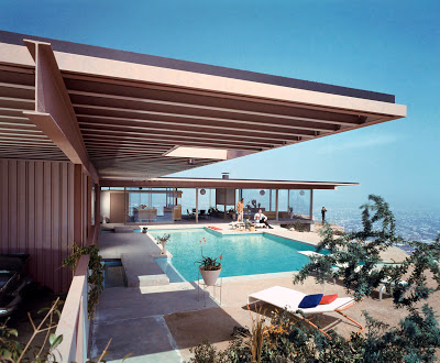
Stahl Residence - Case Study House #22 - THE ARCHITECTURAL PHOTO OF THE TWENTIETH CENTURY- Modern Photo of the Week

Name: Stahl Residence - Case Study House #22
Architect: Pierre Koening
Year Designed: Unknown
Builder: Unknown
Year Built: 1960
Size: Unknown
Location: 1635 Woods Drive, Hollywood Hills, California
Type: Residential
Style: Modern
Status: Good and still owned by the original owner
Photographer: Julius Shulman

As you know we love the photos of Julius Shulman here at KCMODERN. We also love the Case Study House Program for Arts & Architecture magazine and the Stahl House in particular. We have posted it here before and it was named one of The Best Houses of All Time in L.A. This particular photo of the Stahl House, also known as Case Study House #22 is arguably "THE ARCHITECTURAL PHOTO OF THE TWENTIETH CENTURY." It symbolizes the optimistic feeling of the "New" Modern Architecture and certainly typified the California interpretation of the style. Shouldn't everyone in California have a glass house overlooking Sunset Boulevard and the Los Angeles basin!

For more about the making of this iconic photograph read this article from LA magazine and this article from Taschen.

via Shorpy

Modern Photo of the Week - Vintage Allen-Lambe House by Frank Lloyd Wright

Name: Allen-Lambe House http://www.allenlambe.org/
also known as the Henry J. Allen Residence
Allen was Governor of Kansas from 1919-1923 and a United States Senator from 1929-1930
Architect: Frank Lloyd Wright
Year Designed: 1915
Builder:
Year Built: 1918
Size:
Location: 255 North Roosevelt,Wichita Kansas
Type: Residential
Style: Prairie Style (this is a very late FLW Prairie Style House)
Status: Excellent and open for tours by appointment
Photographer: Unknown

Henry J. Allen Residence, located at 255 North Roosevelt. This residence was designed by architect, Frank Lloyd Wright in the Prairie House style. It took two years to complete. Allen was Governor of Kansas from 1919-1923 and a United States Senator from 1929-1930

The Cover Boys of Modernism

What a photo! I wish I was a fly on the wall for this photo shoot.

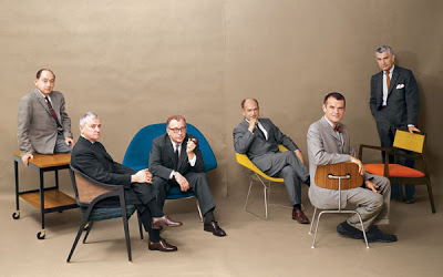
Can you name all of the Design Stars of Modernism in this photo from Playboy Magazine without looking? Perhaps their chairs give you clues to their identities. The furniture from left to right is, Herman Miller Serving Cart (unknown model), circa 1950s; Dunbar 5480 "A" Cane Back Chair, 1954; Knoll 70 "Womb" Lounge Chair, 1948; Knoll 421 Small Diamond Chair, 1950; Herman Miller DCM Chair, 1946; "Caribe Hilton" Open Armchair, 1949.

And the Cover Boys of Modernism from left to right are, George Nelson, Edward Wormley, Eero Saarinen, Harry Bertoia, Charles Eames, Jens Risom. Some were life long friends, others were serious rivals and competitors. Bertoia worked for Eames at one point, but had a falling out. Saarinen and Eames designed the groundbreaking designs for the New York MoMA's Organic Design in Home Furnishings. Eames and Nelson were the primary designers for Herman Miller.

The egos that must have filled the studio while taking that picture. How did they get all of these Design Heroes in the room together? Or did they get them together. Maybe it is two or more photos joined together. There is a peculiar gap in the middle, but that could be the photographer planning ahead for the gutter of this two page spread.

A while back I purchased this July, 1961 issue of Playboy Magazine that contains this article and photo spread and I think it is the best Playboy centerfold ever. This is Modern furniture P O R N. I told my wife that I just bought the magazine for the pictures, not the articles.

Cars of the Presidents

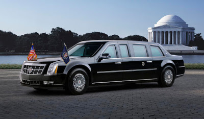
Gearing up for the big day on January 20th, I took a look into the past. Lots of changes over the years! From CBS News: "The 2009 presidential limousine provides the Secret Service with a valuable asset in accomplishing its protective mission by affording its occupants the highest level of protection," a statement from the United States Department of Homeland Security read. The 2009 Cadillac Presidential Limosine has run-flat tires, a sealed interior to ward off a chemical attack and more bulletproof glass area than past presidential limosines. "It looks different [from past models] and it is different in some ways, but it's pretty subtle," General Motors spokesman David Caldwell told Hotsheet. "Although many of the vehicles’ security enhancements cannot be discussed, it is safe to say that this car’s security and coded communications systems make it the most technologically advanced protection vehicle in the world,” said Nicholas Trotta, Assistant Director for the Office of Protective Operations. CBS News White House correspondent Mark Knoller reports that the new limousine is the first of seven that were ordered from Cadillac by the Secret Service. In a radio interview with CBS News, Secret Service Director Mark Sullivan calls the new limo a "state of the art vehicle that gives the highest amount of security and safety to the occupants."

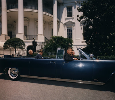
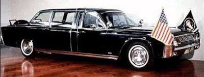
Probably the most famous Presidential limo in history is the Kennedy Lincoln Continental.

Eisenhower had different car styles for different reasons. President Eisenhower's 1950 Lincoln Cosmopolitan.

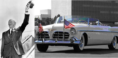
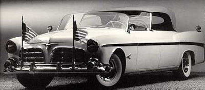
1952 Chrysler Imperial Presidential Parade Car


The New York Times has a great Collectible Car slide show and history. Hail to the Chief!!

Modern Photo of the Week - Dodge House

Name: Dodge House
Architect: Irving Gill
Year Designed: 1916
Builder: Unknown
Year Built: 1916
Size: Unknown
Location: Kings Road, West Hollywood, California
Type: Residential
Style: Modern
Status: DEMOLISHED, 1970
Photographer: Unknown

I conclude my photo homage to the The Best Houses of All Time in L.A., with house number 9, The Dodge House by Irving Gill. The Dodge House is the only house on the list to be demolished, and while this is a tragic loss in itself, I think that overall, the fact that this is the only house on the list that has been demolished, says a lot about the state of preservation in California. They have embraced the heritage of their Modern Architecture. We could learn a lot from groups like the LA Conservancy and their Modern Committee (ModCom). One of my New Years Resolutions is for KCMODERN to become more active in the Kansas City preservation community.

There has been quite a conversation over at Lotta Living about what was the first "Modern" house and whether the Dodge House was a "Modern" house at all... I say yes... What do you think?

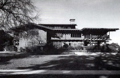
"Modern" Photo of the Week - Gamble House

Name: Gamble House
Architect: Greene and Greene (Brothers, Charles and Henry Greene)
Year Designed: 1907-1908
Builder: Unknown
Year Built: 1909 (custom furniture completed 1910)
Size: Unknown
Location: Pasadena, California
Type: Residential
Style: Bungalow
Status: Recently Restored
Photographer: Unknown

For the official website, photos and tour info about the Gamble House Click Here

For a Behind the Velvet Ropes Tour of the Gamble House by the LA Times Click Here

OK, so it may not be a "Modern" house with a capital M, but it is number six of the The Best Houses of All Time in L.A. mentioned earlier. I consider myself a modernist, but this Greene and Greene house really influenced me in my early career. And while it's plan is not Modern it does represent a movement towards a new architecture and away from the traditional styles of the day. It has been labeled as, The Ultimate Bungalow by recent authors. Movie buffs may also recognize this house and its garage from the Back to the Future Movies.

Modern Photo of the Week - Stahl Residence - Case Study House 22

Name: Stahl Residence - Case Study House #22
Architect: Pierre Koening
Year Designed: Unknown
Builder: Unknown
Year Built: 1960
Size: Unknown
Location: 1635 Woods Drive, Hollywood Hills, California
Type: Residential
Style: Modern
Status: Good and still owned by the original owner
Photographer: Julius Shulman

I was inspired by the previous post about The Best Houses of All Time in L.A. and decided to include a photo of number five from that list. This is one project that I have not visited yet, so I will rely once again on "Uncle" Julius Shulman to provide the wonderful eye candy for this house. I specifically did not use a certain famous photo of that house. Can anyone tell me what photo I am talking about?

Via Shorpy

THEN & NOW -- Drummond Builds Housing for Flood Victims

In response to the housing demand caused by the disastrous flood the summer of 1951, Francie Drummond designed this house plan (there were variations, Gier Sloan, Architect may have been involved) for quickly built and inexpensive housing. (See vintage photo -- sorry photo is stained) Slab on grade foundations, flat roofs and minimalist styling helped keep costs down. Don said they had no land costs and the homes were sold for around $2,000. He said he built around forty of the houses in Kansas City, KS.
They may not exist anymore, we have been unable to locate them, but a nifty little enclave of homes near 55th and Maple, Mission, KS, resemble the flood houses. I remember some were built with flat roofs, others gabled. Now, all have gabled roofs.
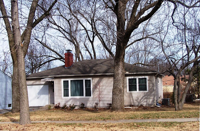
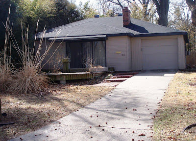
Comparing the photos and disregarding the gabled roofs, vinyl siding and shutters, you can almost see the flat roof and similar window treatment. Sadly, most have lost their crisp modern styling.

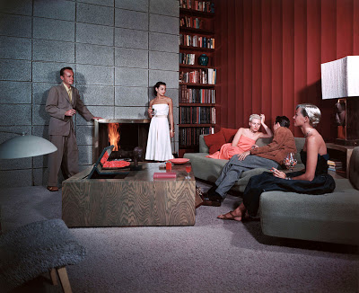
Modern Photo of the Week - Cocktail Hour at the Spencer Residence in Santa Monica, 1950

California Modern: 1950
Photograph by Julius Shulman

And Now For Something Completely Different... How about leaving wintery Kansas City for a little sunny California, Mid-Century time capsule photographed by "Uncle" Julius Shulman!

As if we did not have enough distractions to waste our time on the internet, here is one more. Caution, I wasted a good hour browsing through this one.

I recently discovered Shorpy "Always something Interesting", a photo blog that continually posts interesting vintage photos and then allows it's viewers to contribute funny comments to go along with the photos. Recently Shorpy posted some great Mid-Century Modern picks, so I thought I would grab this one by my favorite architectural photographer Julius Shulman.

I particularly like browsing through comments for the photo above which include, "The guy in the suit and sandals looks like a cross between Woody Harrelson and Hugh Hefner." And "Is that SHAG carpeting on the chair? And why is Mr. Spencer wearing Birkenstocks with his suit?" Other comments include,"This is reminiscent of the mood of the old TV Show, Hugh Hefner's Penthouse Party. It was all so chic and stylishly sophisticated." And, "this is so totally Southern California that I can't stand it."

My favorite comment: "The future was going to be so cool, and look what we did with it."

via Lotta Living

THEN & NOW -- Conecting the Dots- Ralph Myers House


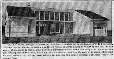
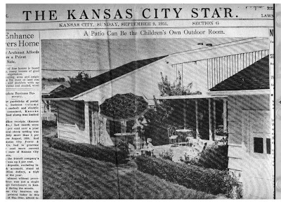
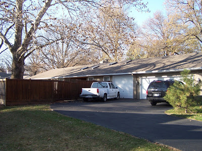
I agree with Robert, I'm a big fan of Kivett and Myers work. Though the firm did very little residential work, Ralph Myers designed his own home, as seen here in the newspaper, built by Don Drummond in Prairie Village, KS in 1947. The house featured passive solar heating through the large south windows and outdoor living on the "protected" patio. The recent photo is as close to the angle of the vintage photo as I could get. A privacy fence blocks any view of the alterations that enclosed and changed the original intent of the design. The house has additions and modifications that make it unrecognizable as originally built.