Better Homes & Gardens Decorating Book Cover - 1961- Modern Illustration

Wow it has been a while since I posted. Attribute it to Post Runnells Tour recovery I guess. Lets kick things back off with and image or two.
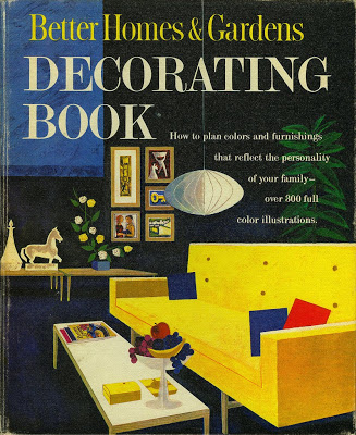
What can I say about this image from the cover of the 1961 Better Homes & Gardens Decorating Book? It just oozes Mid Century Modern Goodness! The primary colors, the MCM art, the Nelson bubble lamp, the sofa, the tables, the fruit bowl all make me drool. It even has a copy of BH&G magazine on the coffee table.... This kind of artwork makes me wish I lived in that era. This might have been the best two bucks I ever spent on a book.

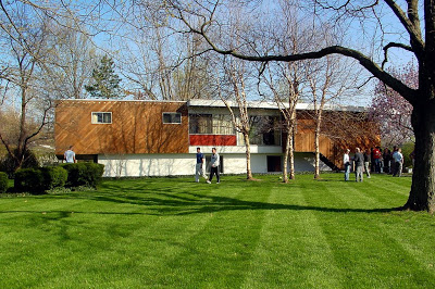
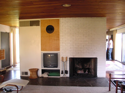
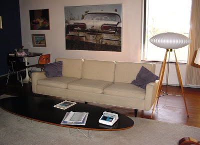
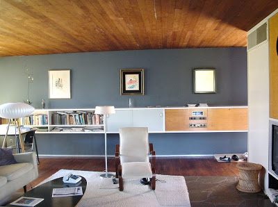
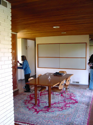
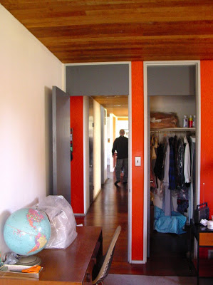
Snower Residence by Architect, Marcel Breuer - Photo(s) of the Week

Name: Snower Residence
Architect: Marcel Breuer
Year Designed: 1954
Builder: Unknown
Year Built: 1955
Size: Unknown sq. ft. 3 bedroom 2 bath
Location: Mission Hills, Kansas
Type: Residence
Style: International Style
Status: Endangered due to the value of the lot in Kansas City's most affluent neighborhood
Photographer: Robert McLaughlin

Description: This residence was built by its current owner who commissioned Breuer to design it for them in 1954. The owners have painstakingly maintained the original interiors as designed by the architect. The exteriors also remain exactly as they were originally planned. The house was designed as a long and narrow box, housing the living and bedroom spaces, built on a masonry base containing the garage and a family room. Large cantilevers at both ends dominate the design much like Breuer's own house built in 1947, in New Canaan, Connecticut. This may be one of only two Breuer House built West of the Mississippi. It is likely one of the most original Breuer Houses standing today.

I had to dig around my hard drive to find these photos taken with my first digital camera back in April of 2004. They are more candid snapshots than architectural photography but they give you a taste of the exterior and interior of the house.


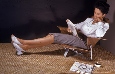
Experimental Eames Lounge Chair

Well this experimental chair is something that Charles and Ray Eames never put into production and the 1946 date on the photo predates the ubiquitous Eames Lounge Chair production by ten years. The chair is contemporaneous with the introduction of the Eames LCM and the seat shows some relationship to that design. But we can see that the many of the design elements of the Eames Lounge Chair are there. The curve of the seat, the back and arms as separate plywood pieces are all represented in the classic Eames Lounge Chair. Just add the beautiful leather upholstery.

The chair does show a rather crude, by Eames' standards, leg and arm attachment, which begs the question, was this a prototype to test the seating comfort only? Or was this simply early in Eames' career before their refinement skills were brought up to the highly refined standards we expect to see in Eames furniture today?

Via Shorpy

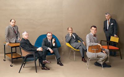
The Cover Boys of Modernism

What a photo! I wish I was a fly on the wall for this photo shoot.

Can you name all of the Design Stars of Modernism in this photo from Playboy Magazine without looking? Perhaps their chairs give you clues to their identities. The furniture from left to right is, Herman Miller Serving Cart (unknown model), circa 1950s; Dunbar 5480 "A" Cane Back Chair, 1954; Knoll 70 "Womb" Lounge Chair, 1948; Knoll 421 Small Diamond Chair, 1950; Herman Miller DCM Chair, 1946; "Caribe Hilton" Open Armchair, 1949.

And the Cover Boys of Modernism from left to right are, George Nelson, Edward Wormley, Eero Saarinen, Harry Bertoia, Charles Eames, Jens Risom. Some were life long friends, others were serious rivals and competitors. Bertoia worked for Eames at one point, but had a falling out. Saarinen and Eames designed the groundbreaking designs for the New York MoMA's Organic Design in Home Furnishings. Eames and Nelson were the primary designers for Herman Miller.

The egos that must have filled the studio while taking that picture. How did they get all of these Design Heroes in the room together? Or did they get them together. Maybe it is two or more photos joined together. There is a peculiar gap in the middle, but that could be the photographer planning ahead for the gutter of this two page spread.

A while back I purchased this July, 1961 issue of Playboy Magazine that contains this article and photo spread and I think it is the best Playboy centerfold ever. This is Modern furniture P O R N. I told my wife that I just bought the magazine for the pictures, not the articles.