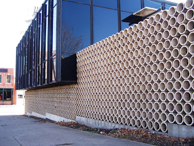
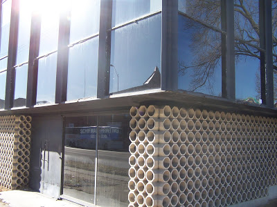
 I was in the Crossroads area of Kansas City, MO the other day when I saw the Kivett and Myers and McCallum designed commercial building in the Mies Van Der Rohe manner, with clean lines and walls of glass. . .
I stopped, got out of the car and took theses snapshots of the building. Click on images to enlarge.
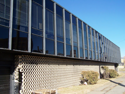 Upon closer inspection, I could see deteriorating elements such as cracked and missing blocks on the "light and shadow" lower facade. . .
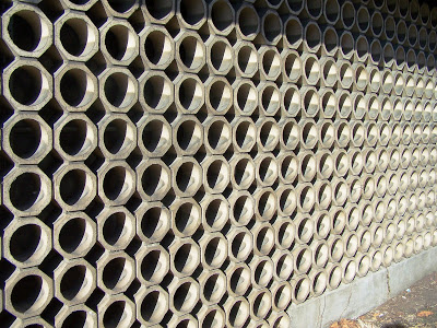 Many metal frames are rusted and up close you can see the differed maintenance. This is a great looking little building done in 1961. Sorry for this last shot, the sun wasn't cooperating. I wanted to show the juncture of the tiles and the way the tile wall kind of makes your eyes vibrate. Note the door with cool handles.
 It looks as if it feels taken for granted, so many cars pass by daily. We can ill afford to lose another K & M designed building. We should be celebrating K & M buildings, but unfortunately we've watched some of them deteriorate and/or get torn down.
